Purra
Supporting every stage of her story
Purra is a women's health supplement brand built on science and empathy. Its range — Metabolic, Menopause and Fertility Support — is designed to support women through every phase of life, with a promise as clear as its formulations: supporting every stage of her story.

The Project
Purra needed an identity as considered as its formulations — calm, premium and trustworthy, speaking to women’s health without shouting. Ruler created the brand end to end, from symbol to shelf.
What we did
- Brand strategy & positioning — “Supporting every stage of her story”
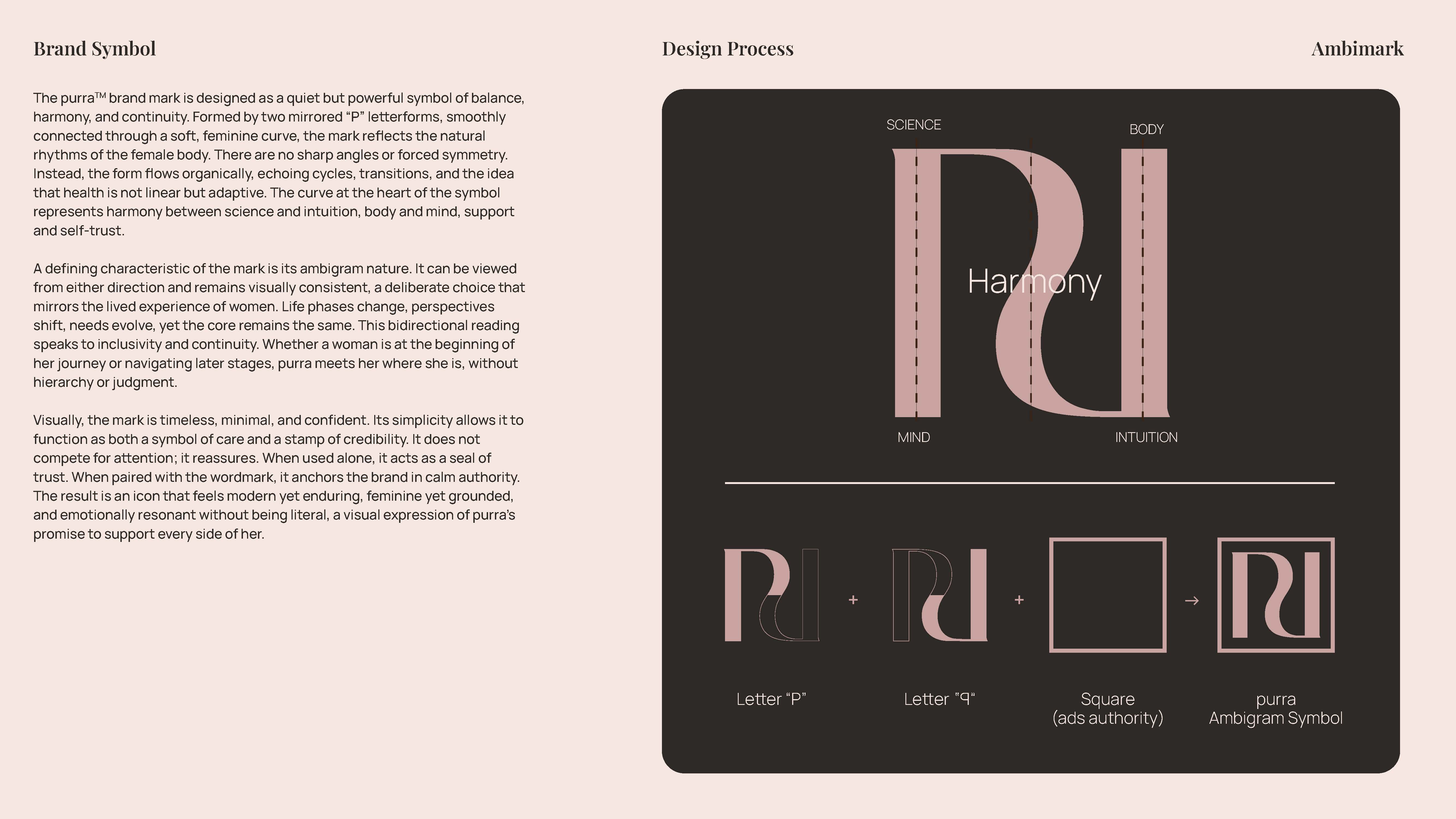
- Ambigram ‘PU / RR’ symbol and wordmark system
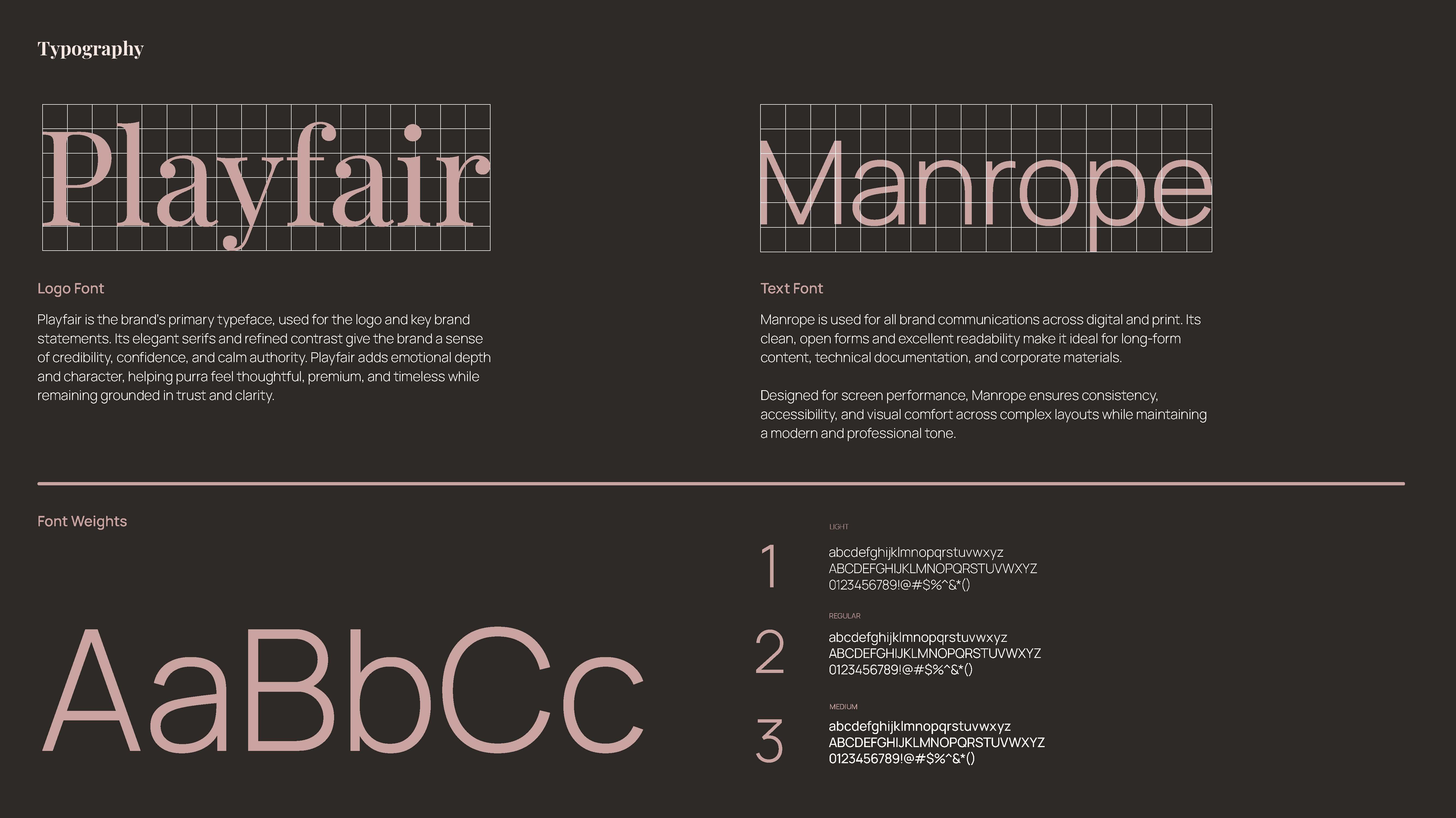
- Typography — Playfair Display & Manrope
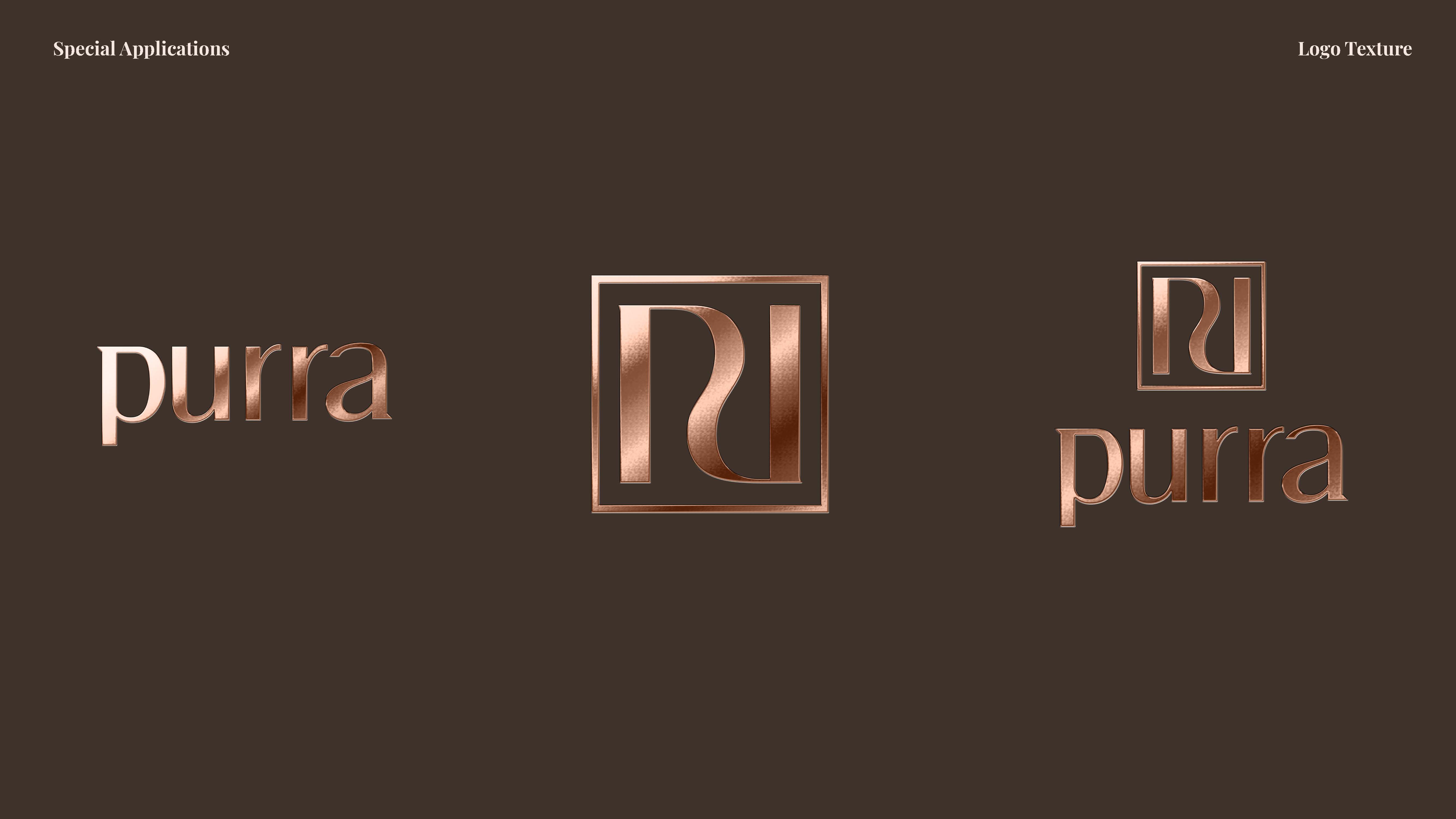
- Calm, premium palette — Dusty Pink, Skin Beige, Warm Copper, Grounded Earth
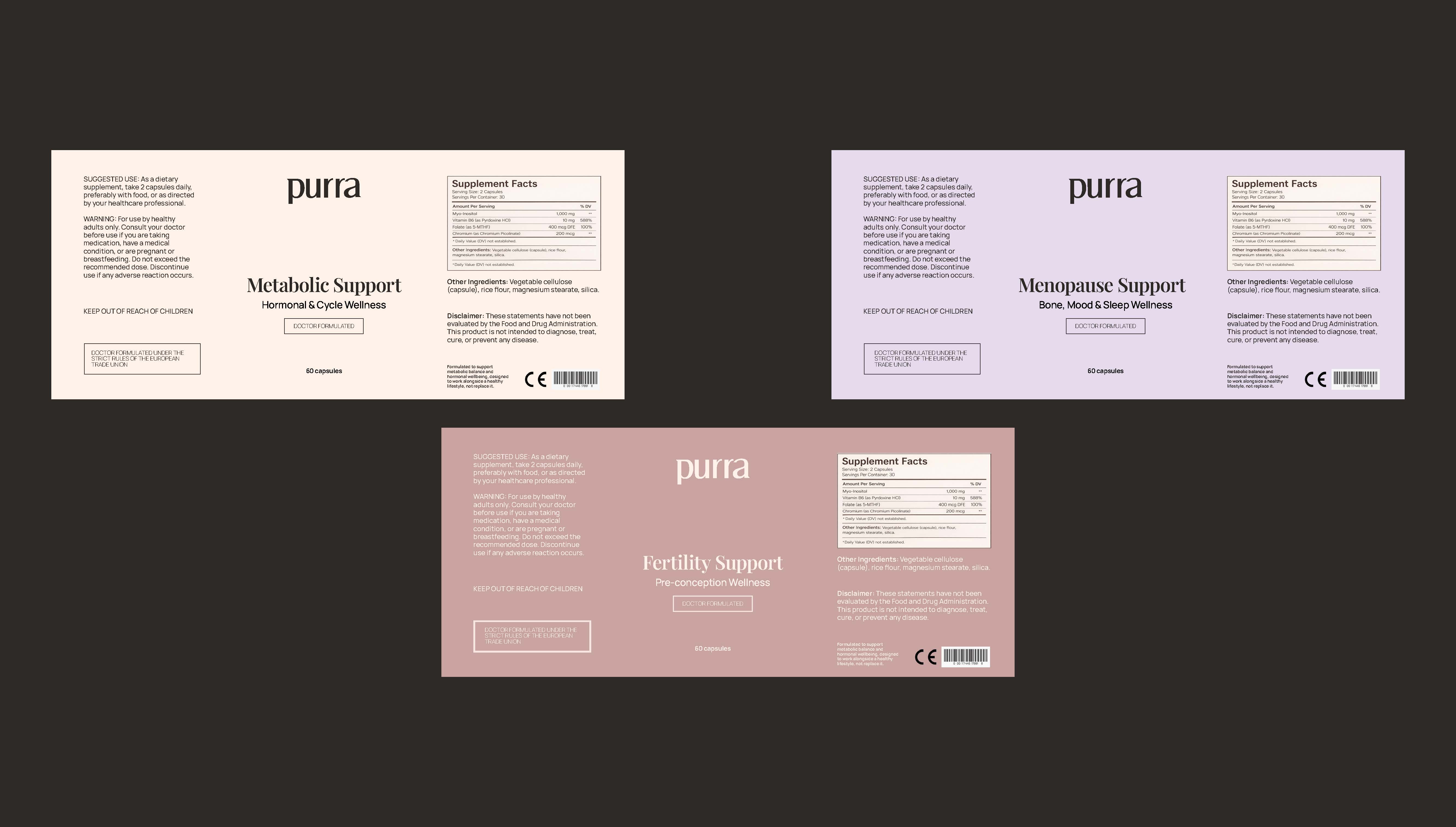
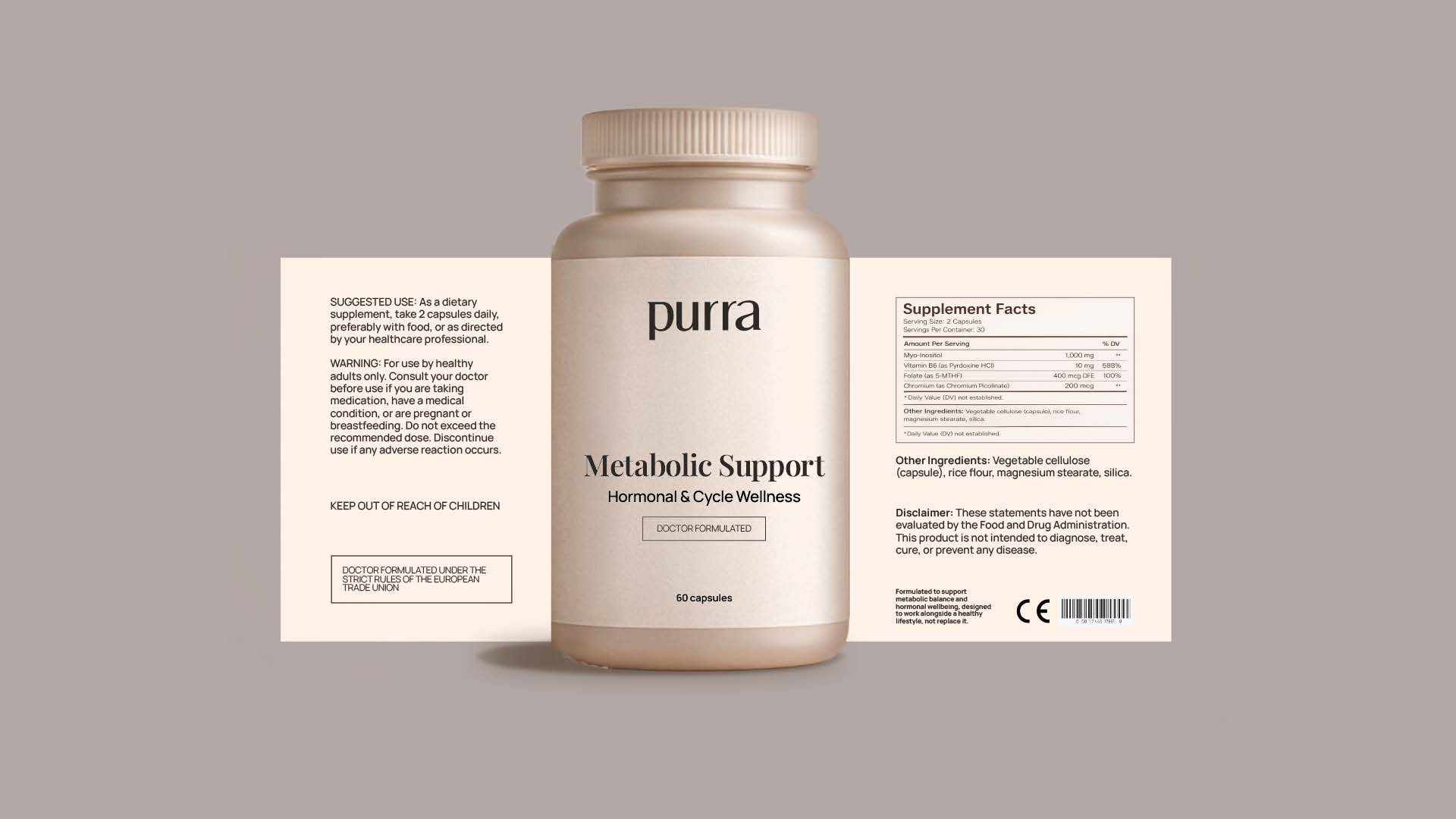
- Product & packaging design — supplement labels and bottles
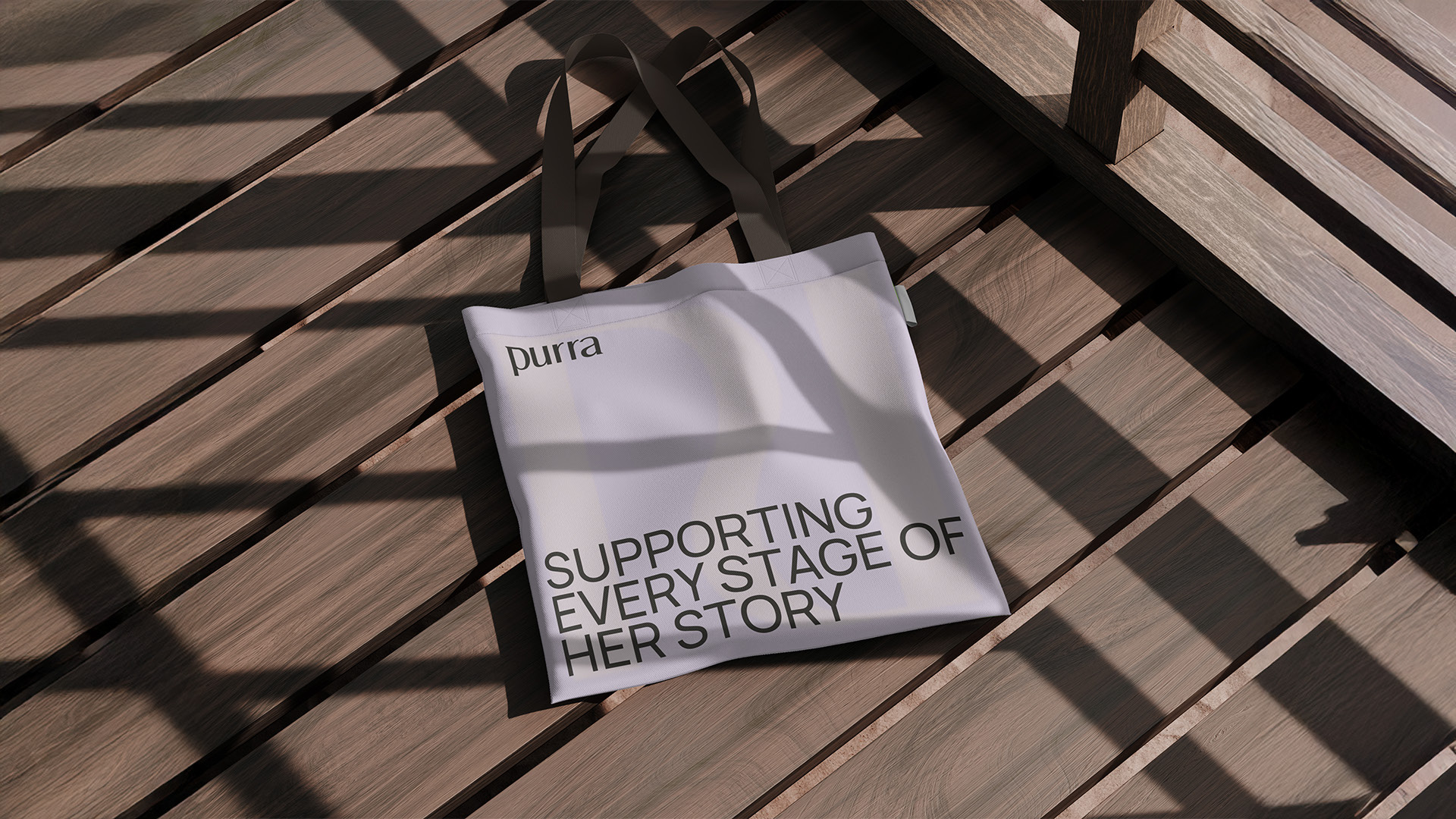
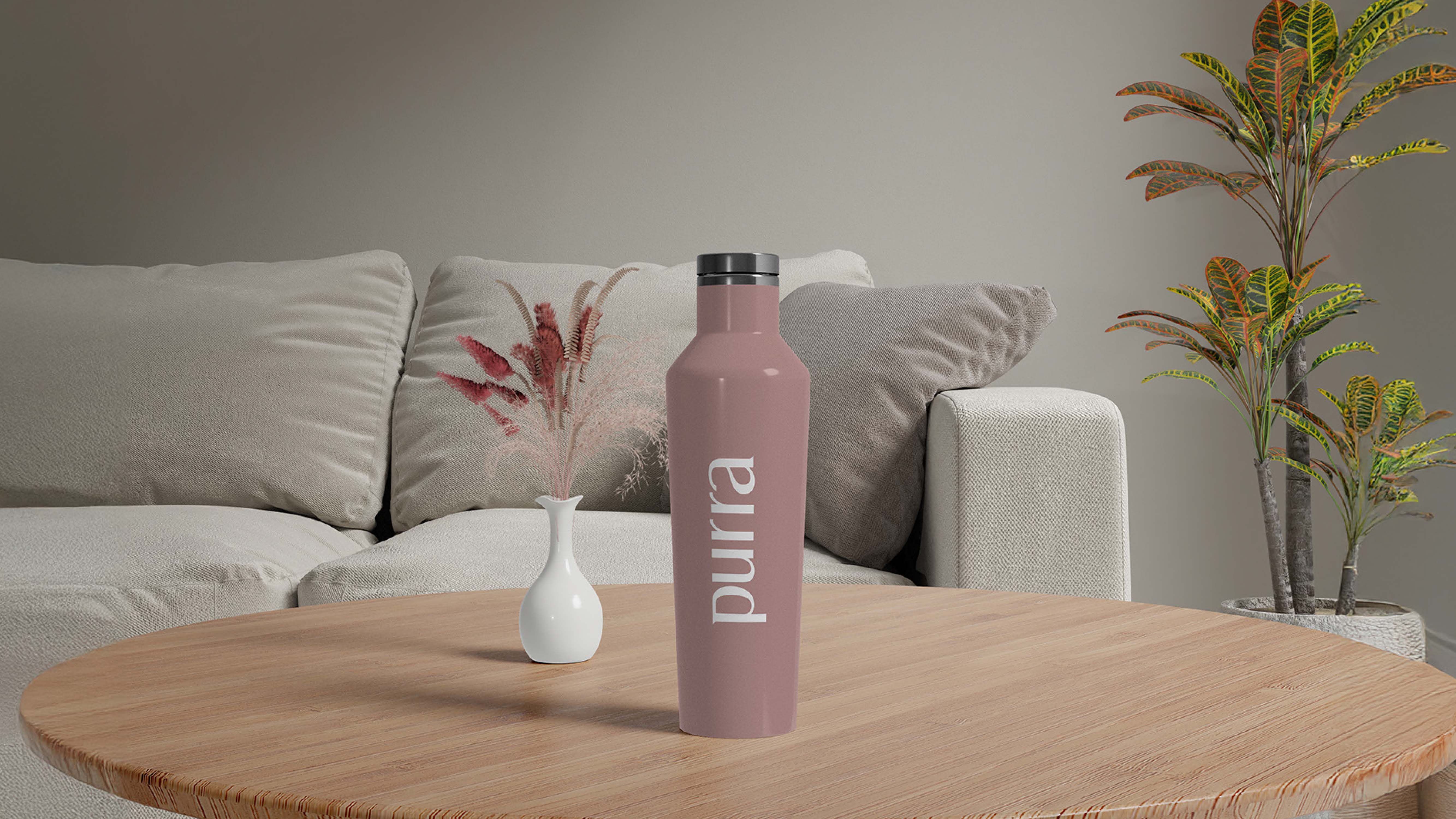
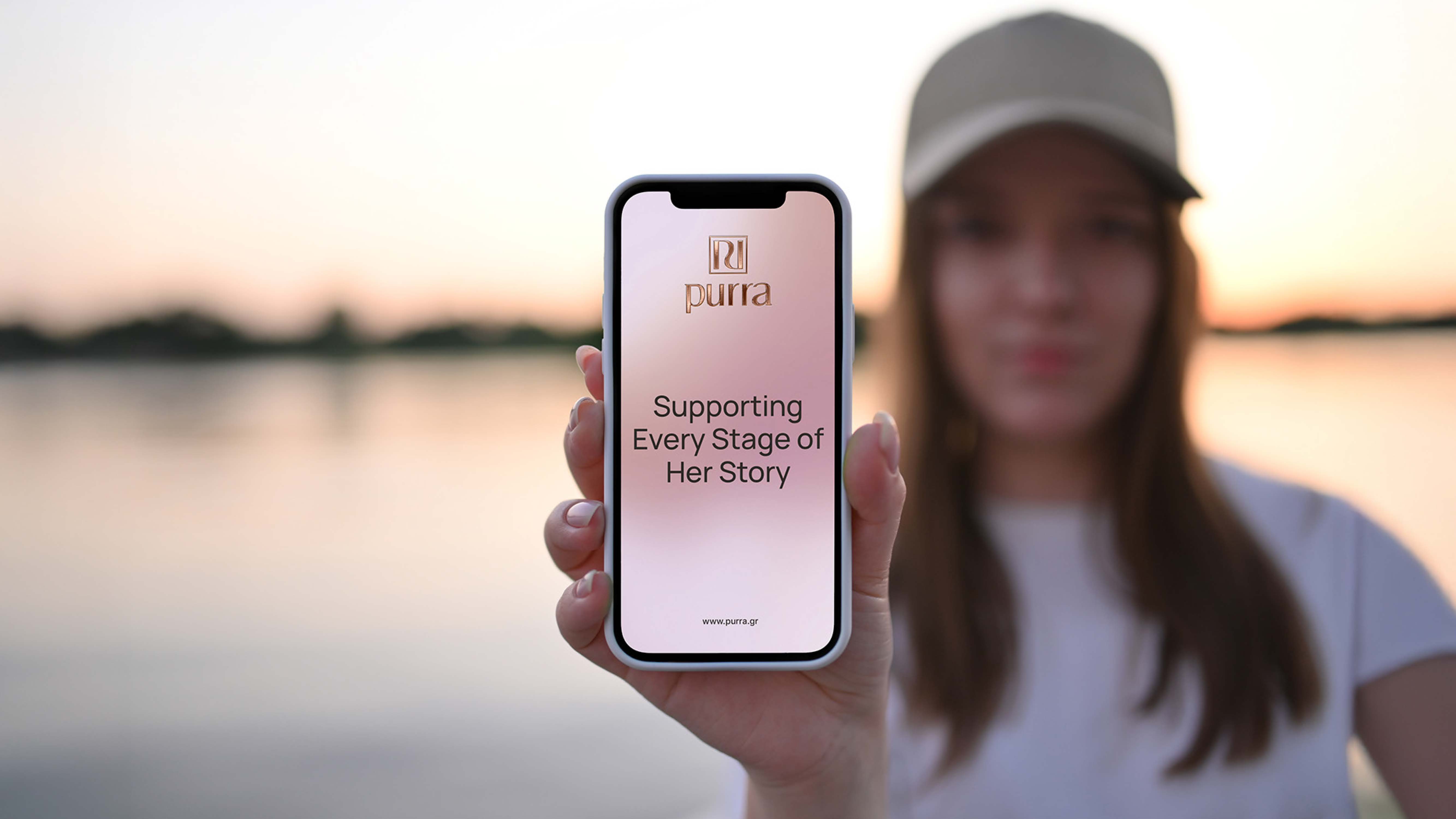
- Applications — stationery, merchandise, lifestyle and app / digital UI
- Brand guidelines
Branding
Purra is a women’s health brand that had to feel calm, premium and trustworthy — scientific without being clinical, feminine without being soft. Ruler built the identity from the ground up around a single idea: supporting every stage of her story.
At its heart is an ambigram — two mirrored letterforms (P and R) that read the same either way, a quiet symbol of balance, harmony and continuity that mirrors the phases of a woman’s life. It pairs with Playfair Display and Manrope, and a considered palette of Dusty Pink, Skin Beige, Warm Copper and Grounded Earth that feels supportive and grounded rather than attention-seeking.
We extended the system from symbol to shelf — supplement packaging and labels (Metabolic, Menopause and Fertility Support), stationery, merchandise, lifestyle and a full digital and app UI — codified in a complete brand-guidelines document so Purra stays consistent and credible across every touchpoint.