Rockstone
Engineering clarity for biotech manufacturing
VISIT WEBSITERockstone partnered with Ruler to design and build a custom website that reflects the brand and performs. The site is built with WordPress, React, Swiper.

The Project
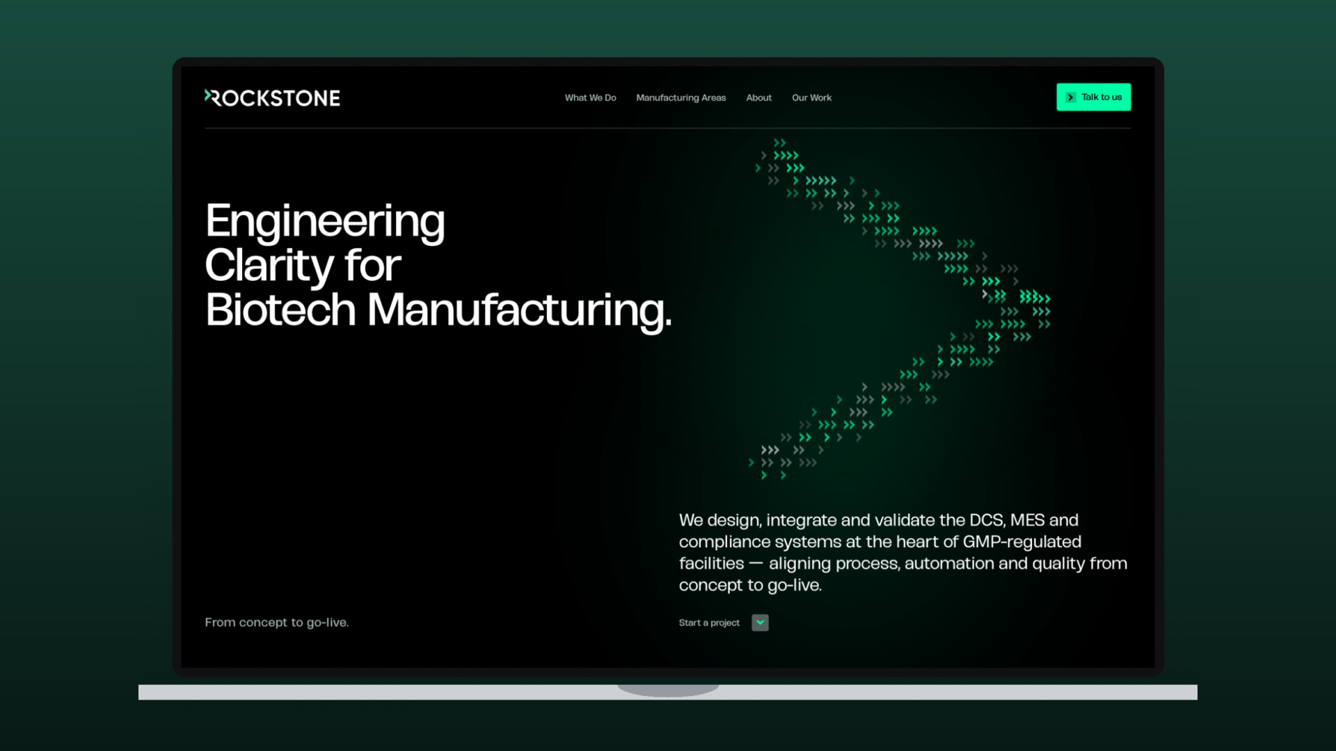
Rockstone Engineering delivers DCS, MES and compliance systems for GMP-regulated biotech manufacturing. They needed a presentation website with the precision of the work itself — fast, technical and cinematic. Ruler designed and built a custom WordPress site with a 3D motion identity that turns Rockstone’s logo symbol into the centrepiece.
What we did
- Custom WordPress presentation website
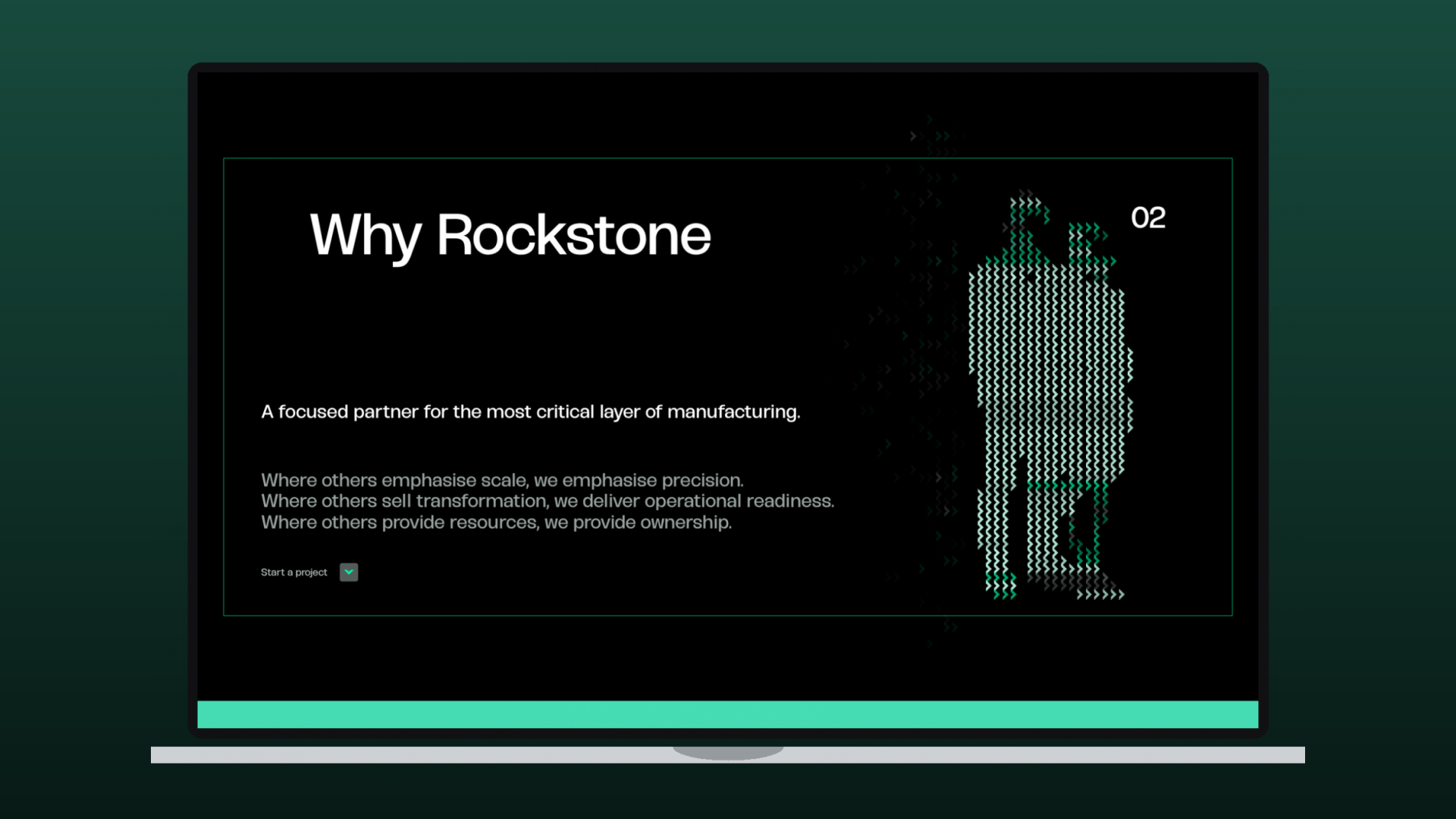
- Three.js / WebGL animation of the logo symbol in the hero and Why Rockstone sections
- GSAP scroll-triggered motion throughout
- UI/UX and art direction aligned to the new brand
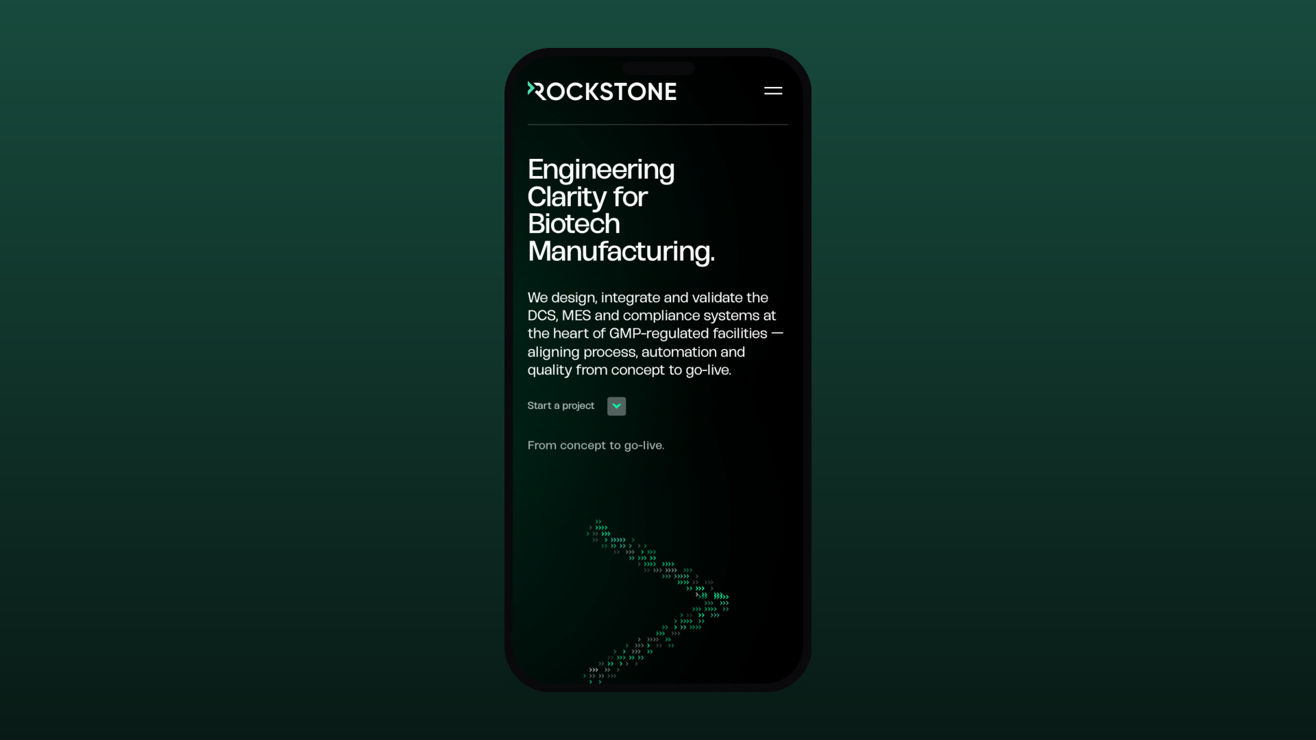
- Responsive build and on-page SEO
Web Design & Development
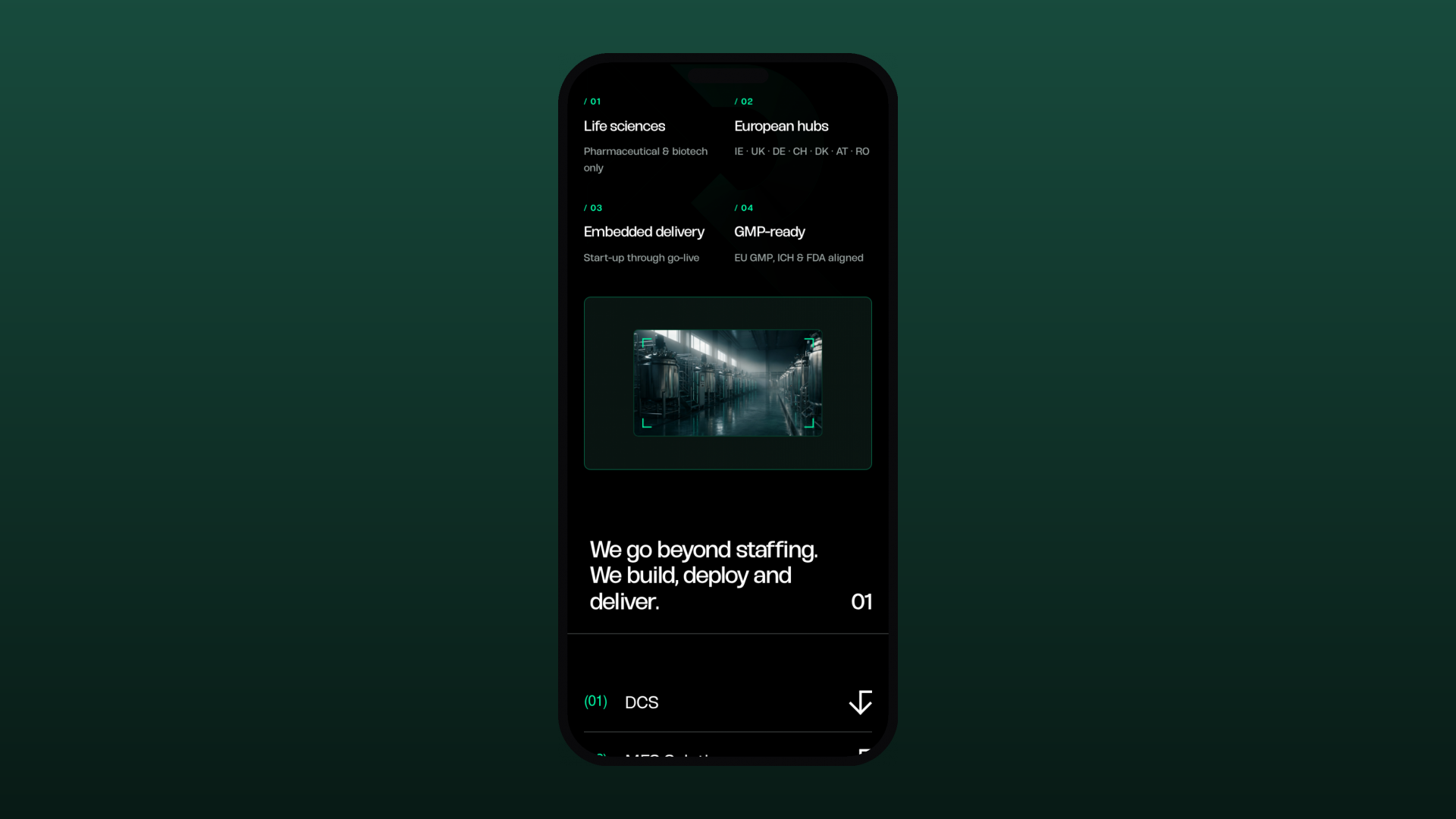
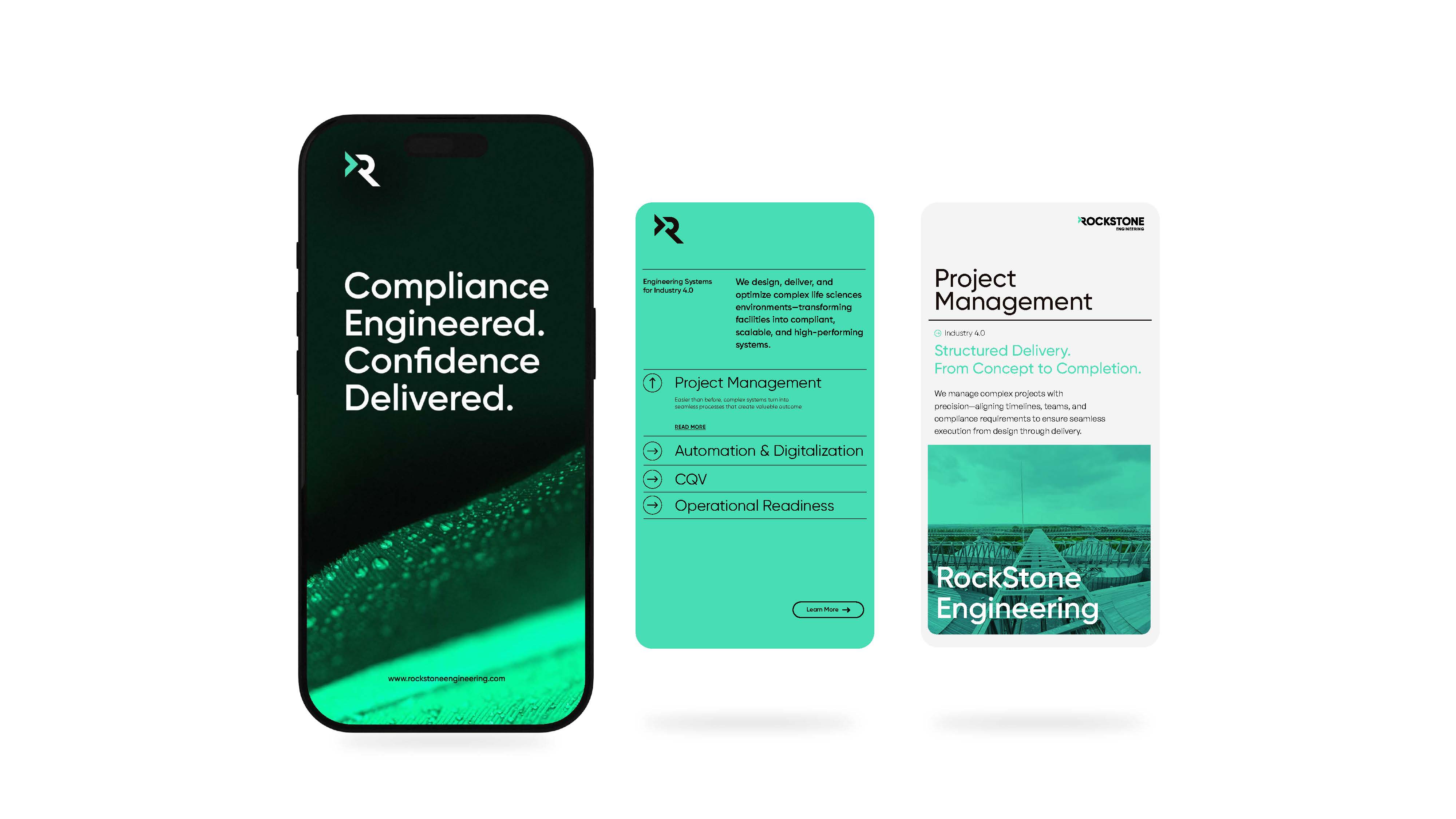
Rockstone Engineering configures DCS, MES and compliance systems at the heart of GMP-regulated biotech facilities. The brief to Ruler was a presentation website as precise and considered as that work — and one that showed, not told. We designed and built a custom WordPress site with a cinematic, dark, motion-led feel.
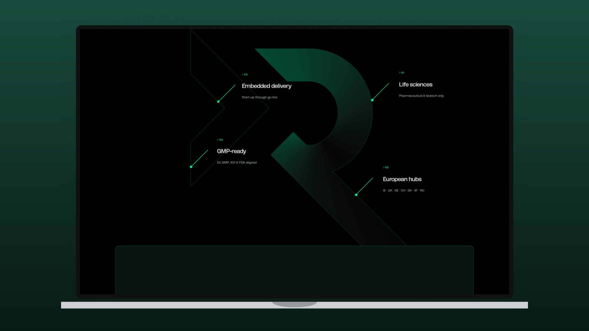
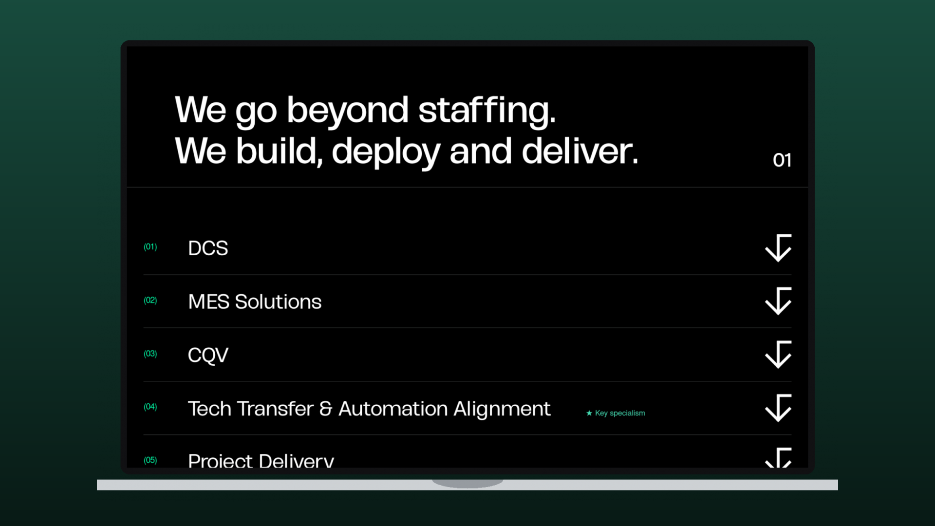
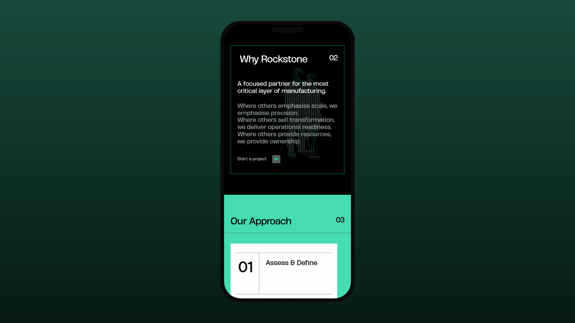
The centrepiece is a 3D motion identity: the Rockstone ‘R’ symbol is rebuilt in WebGL with Three.js and animated in the hero and the Why Rockstone section — assembling from geometric shapes into the final mark. GSAP and ScrollTrigger drive reveals and transitions the whole way down, keeping dense, technical content (DCS, MES, CQV, tech transfer) light and legible.
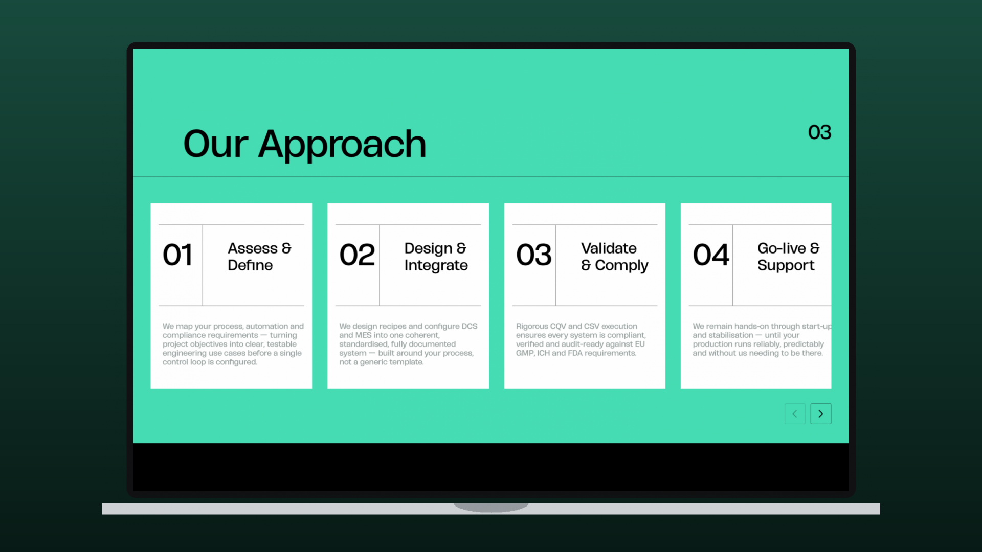
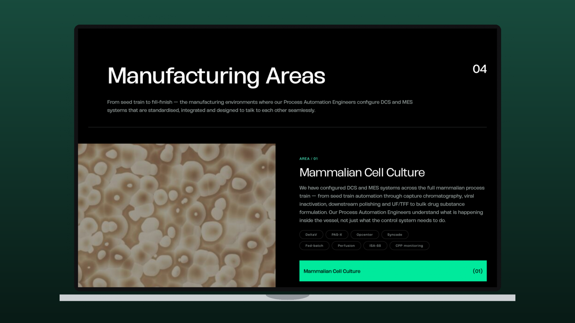
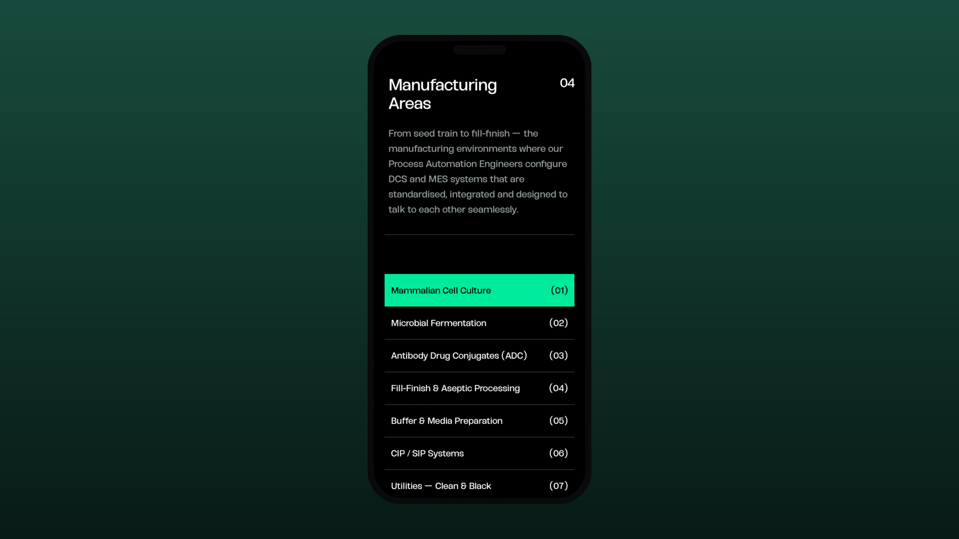
Content is organised into clear chapters — the value proposition, capabilities, Why Rockstone, Our Approach and Manufacturing Areas — on a fast, responsive, SEO-ready build that matches the new brand and positions Rockstone as the specialist layer between complexity and engineered clarity.
Branding
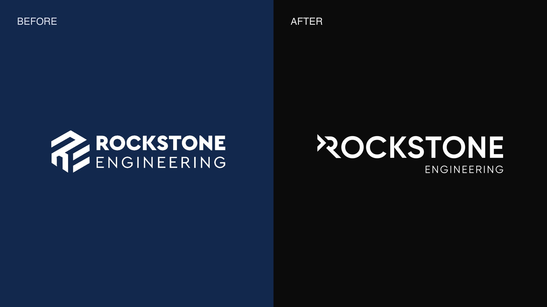
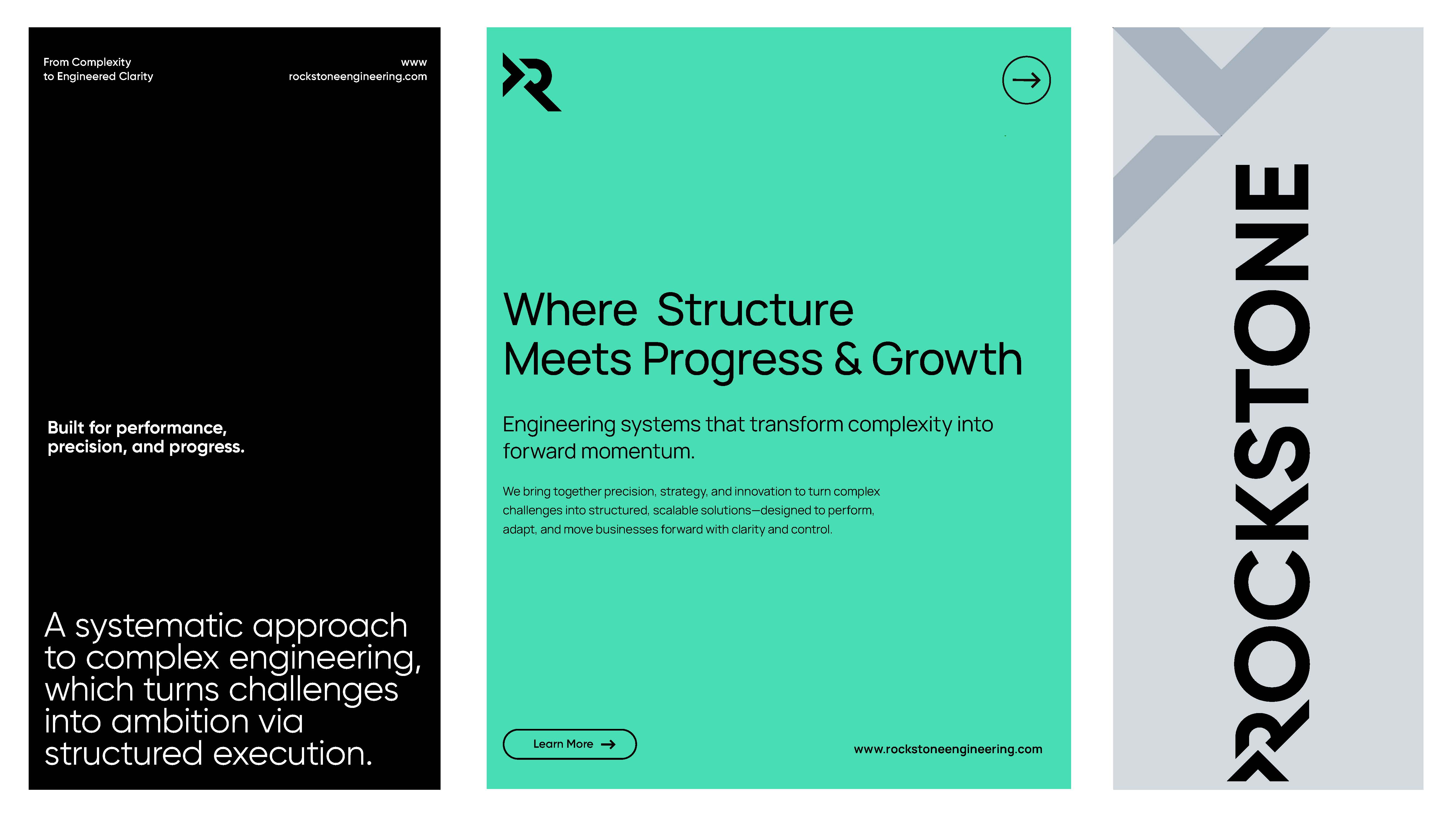
Alongside the website, Ruler delivered Rockstone Engineering’s full rebrand — an identity as engineered as the systems they build for biotech manufacturing.
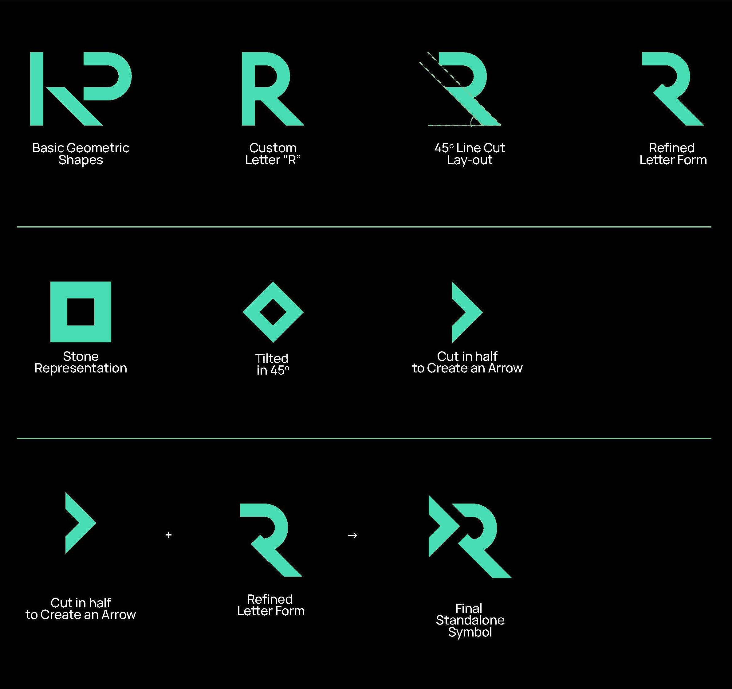
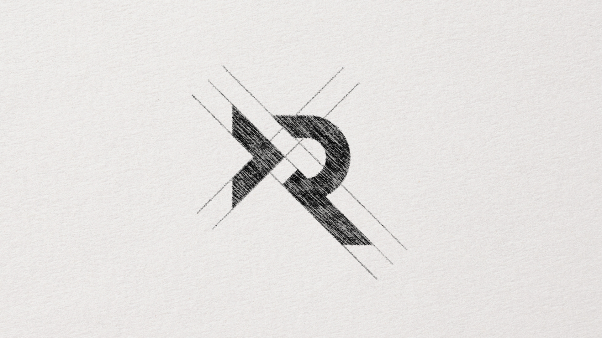
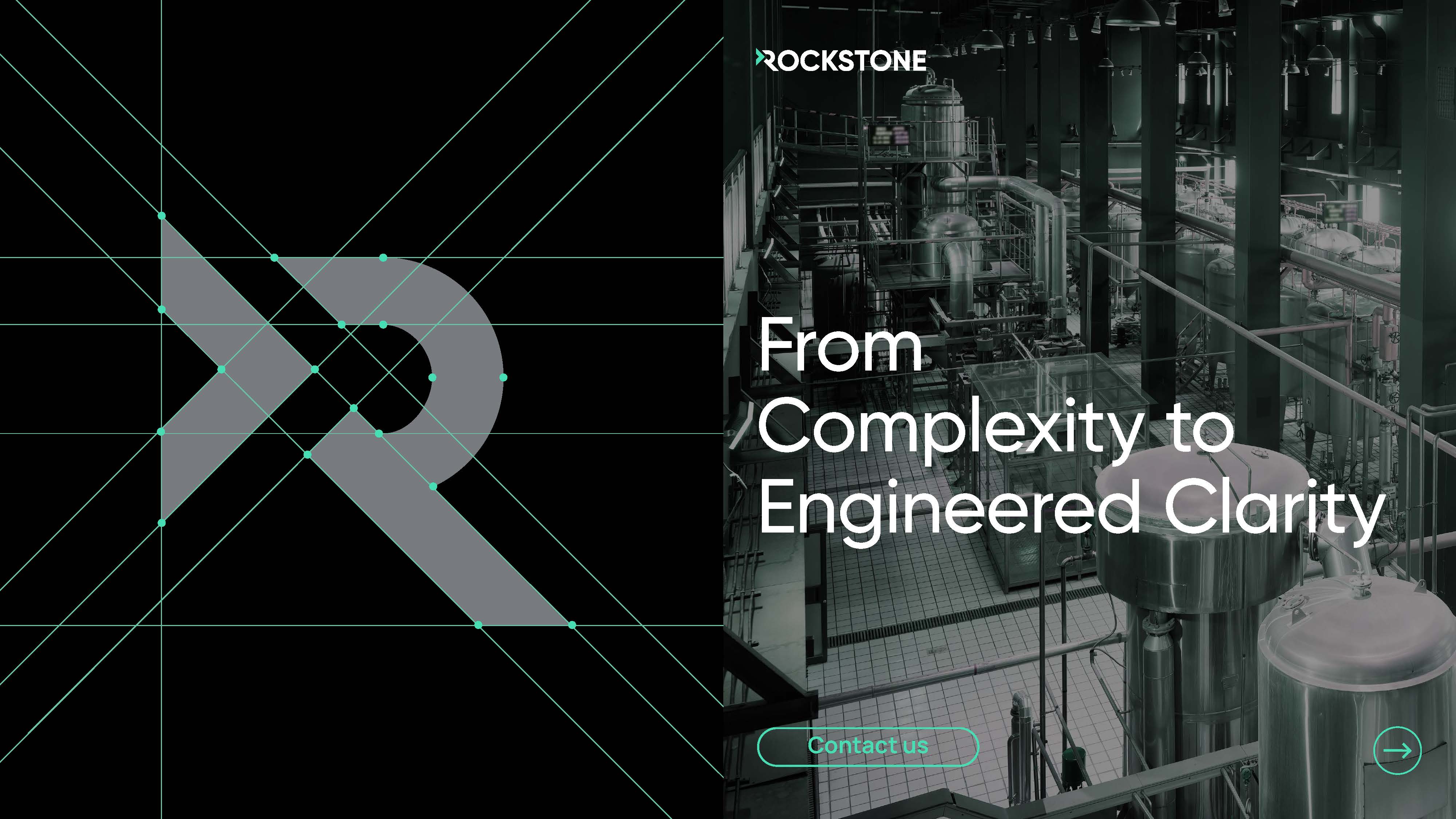
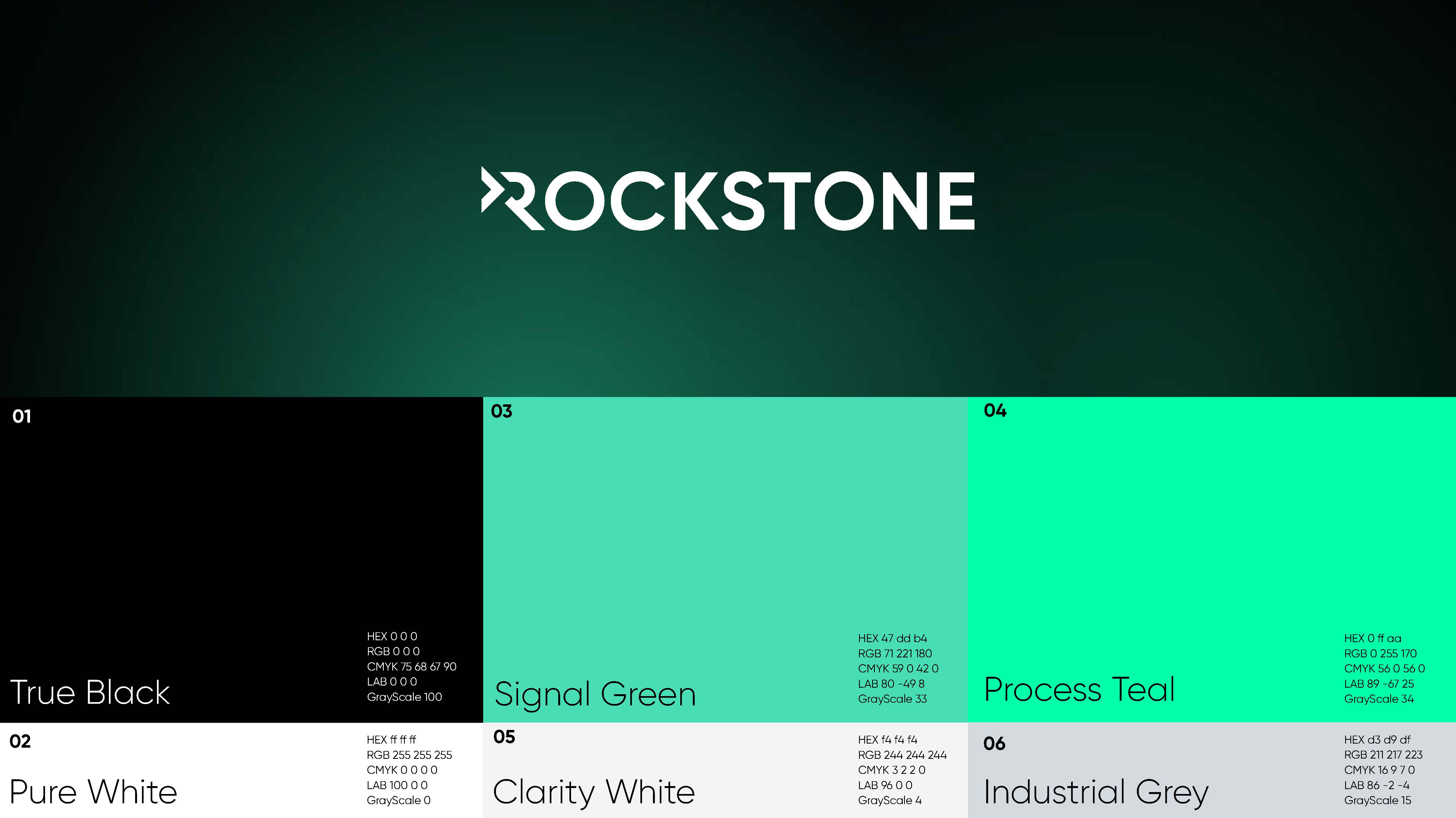
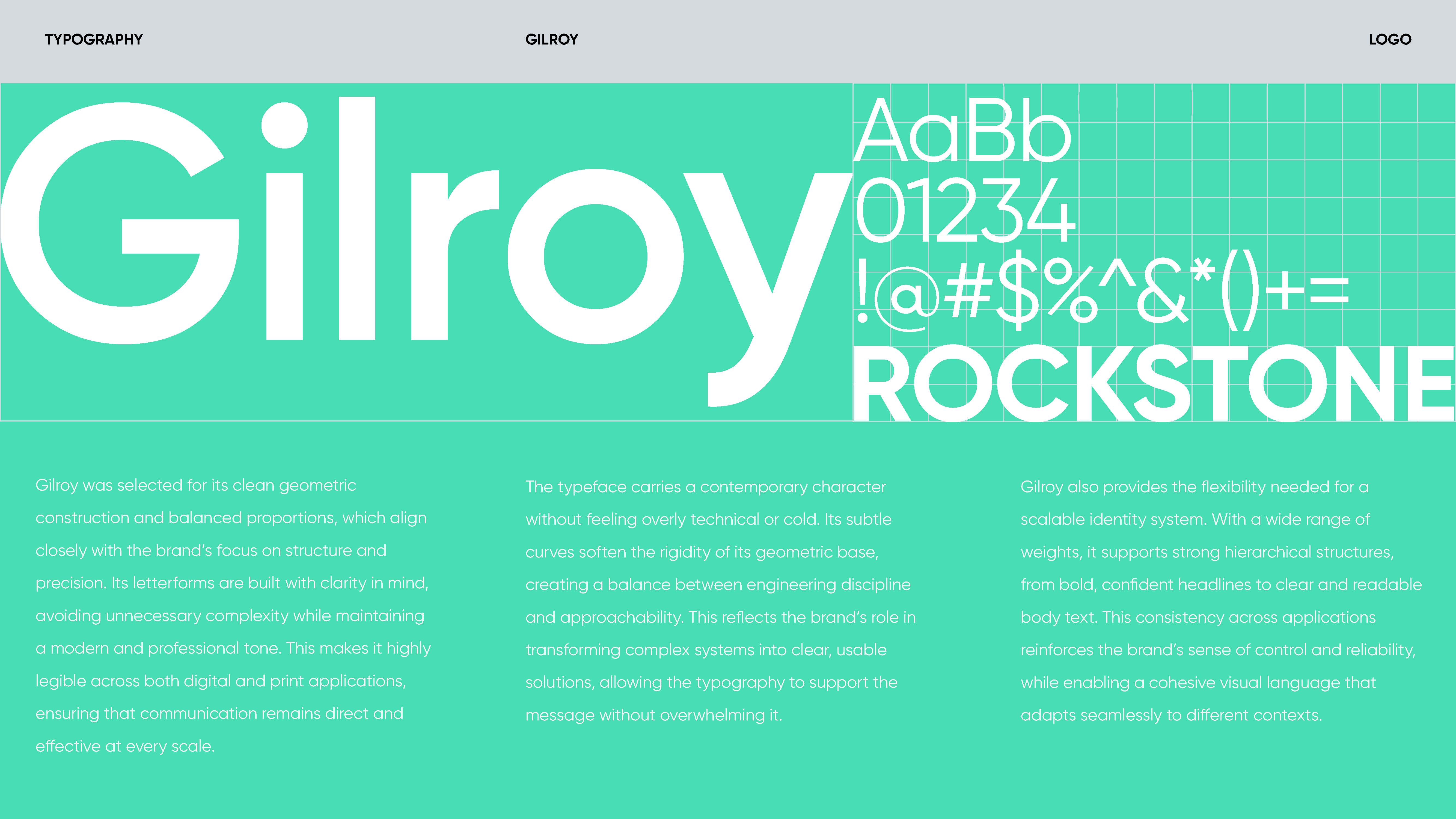
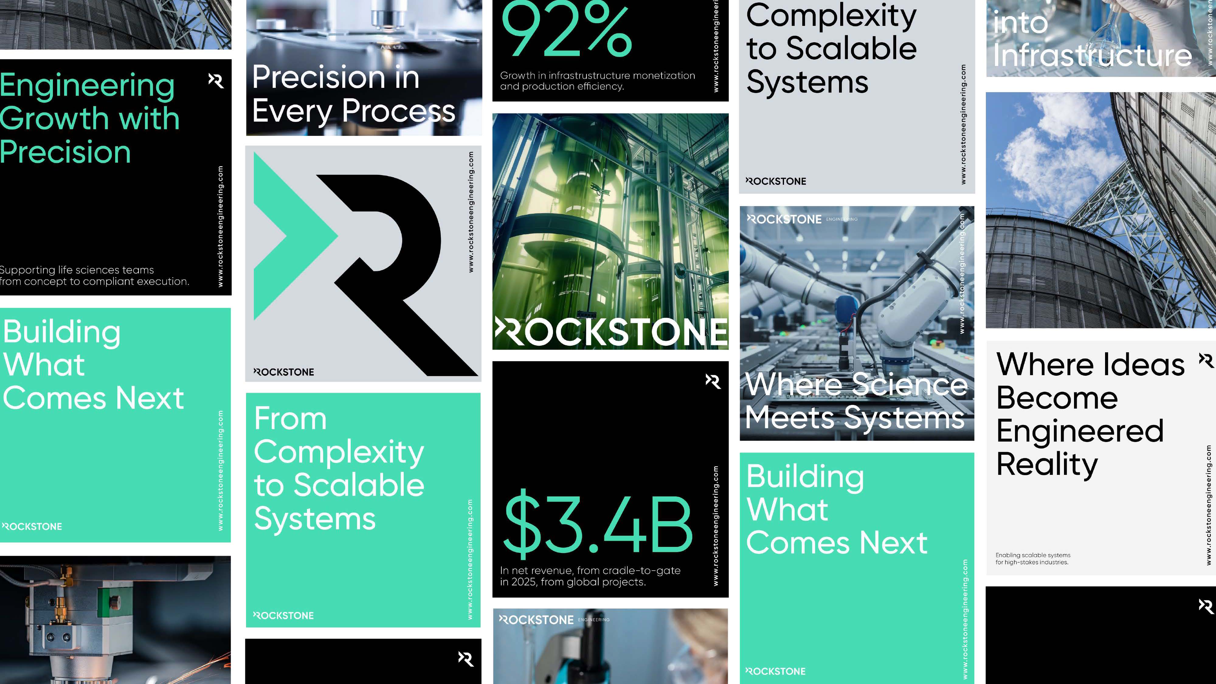
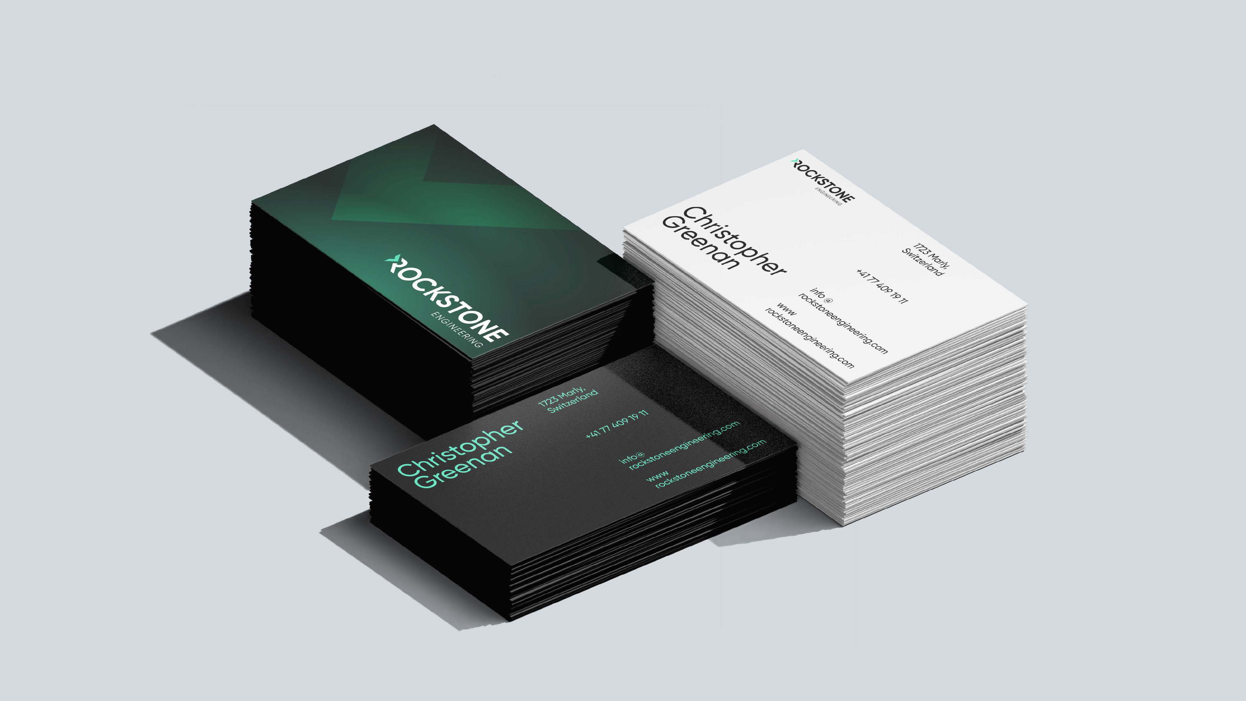
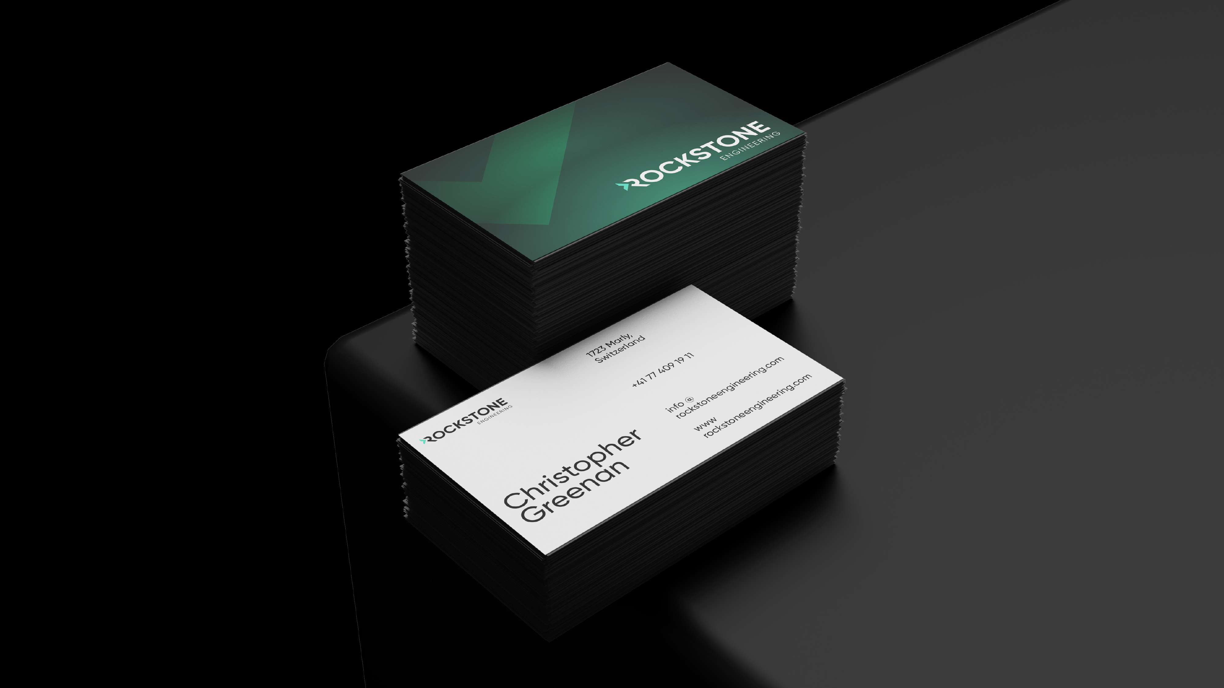
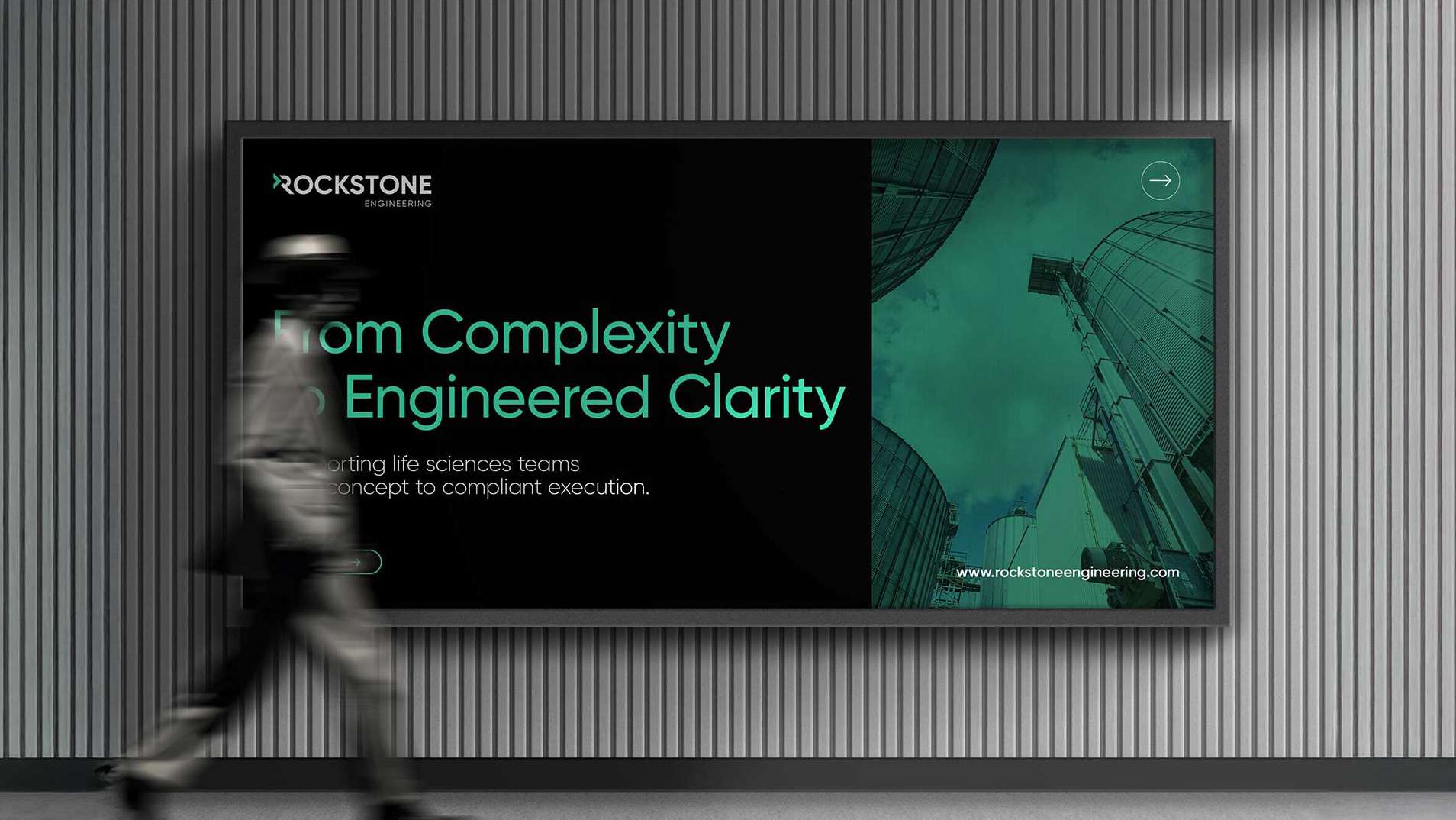
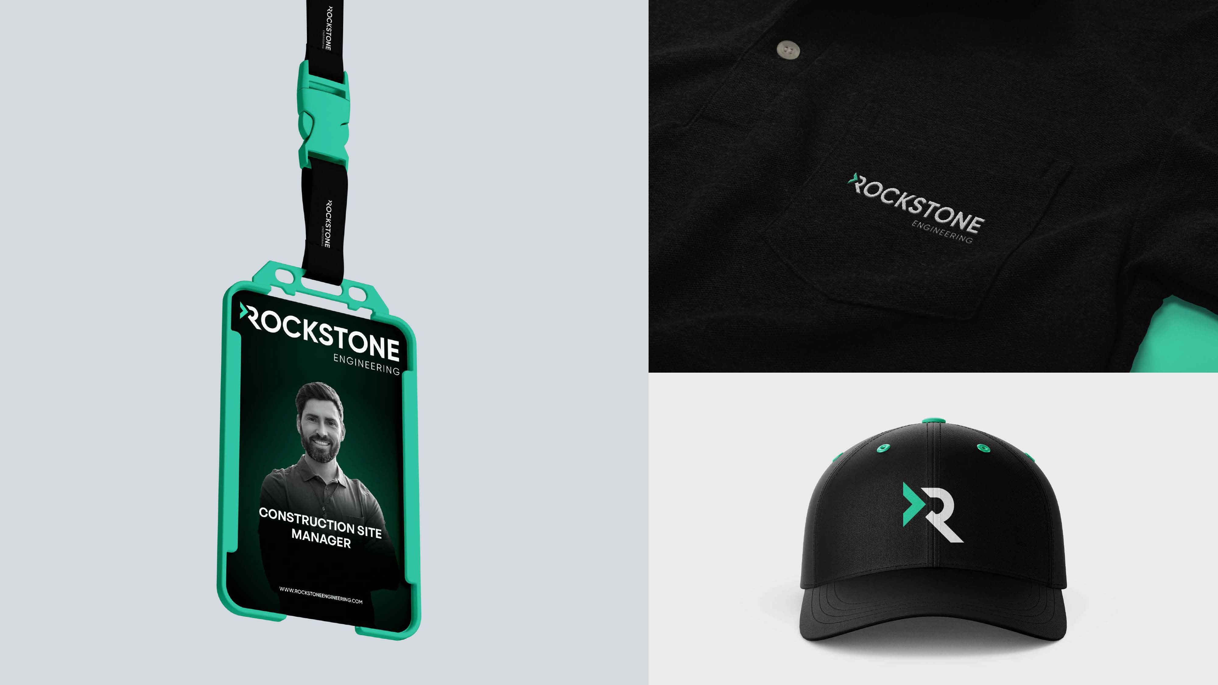
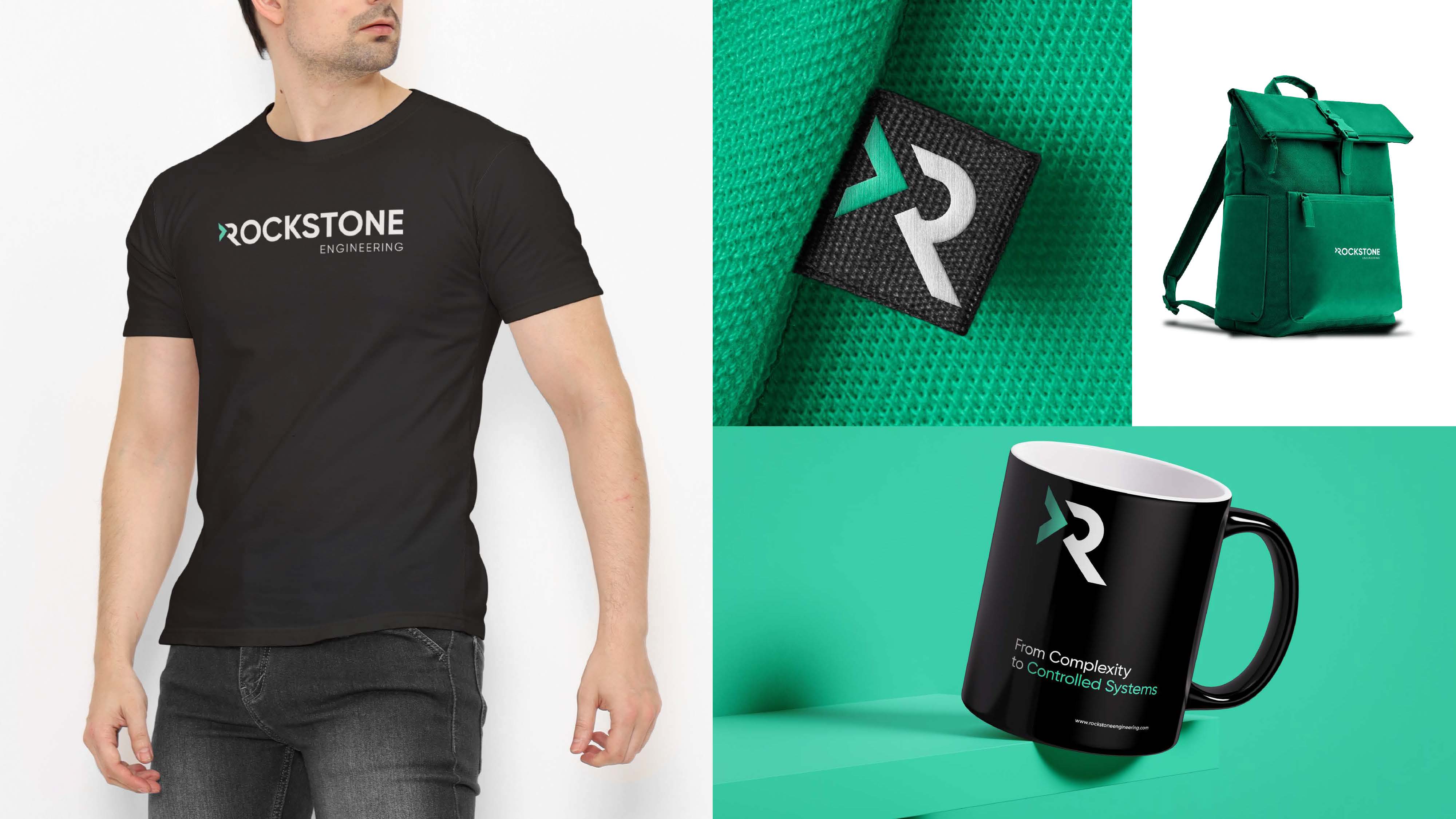
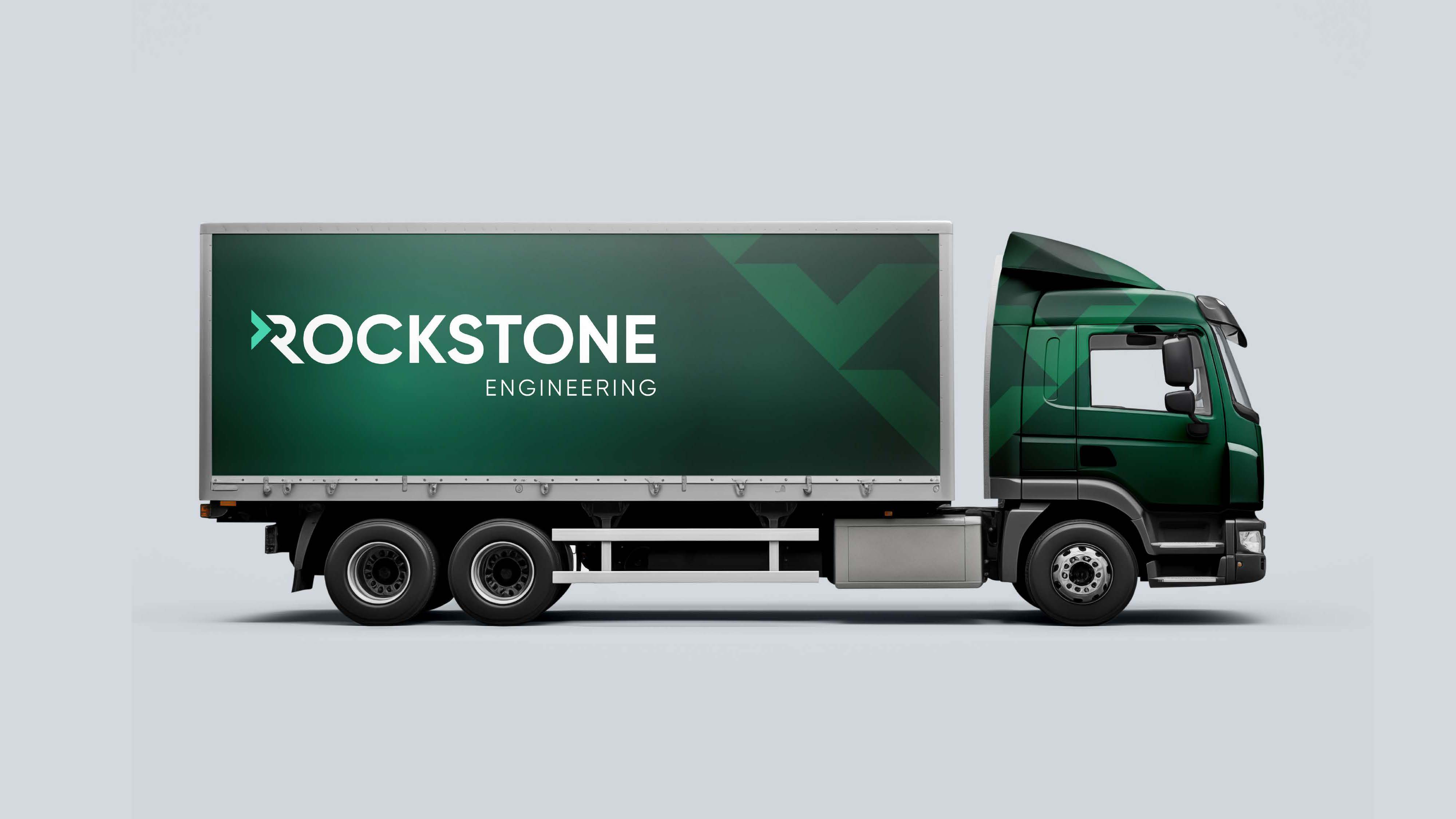
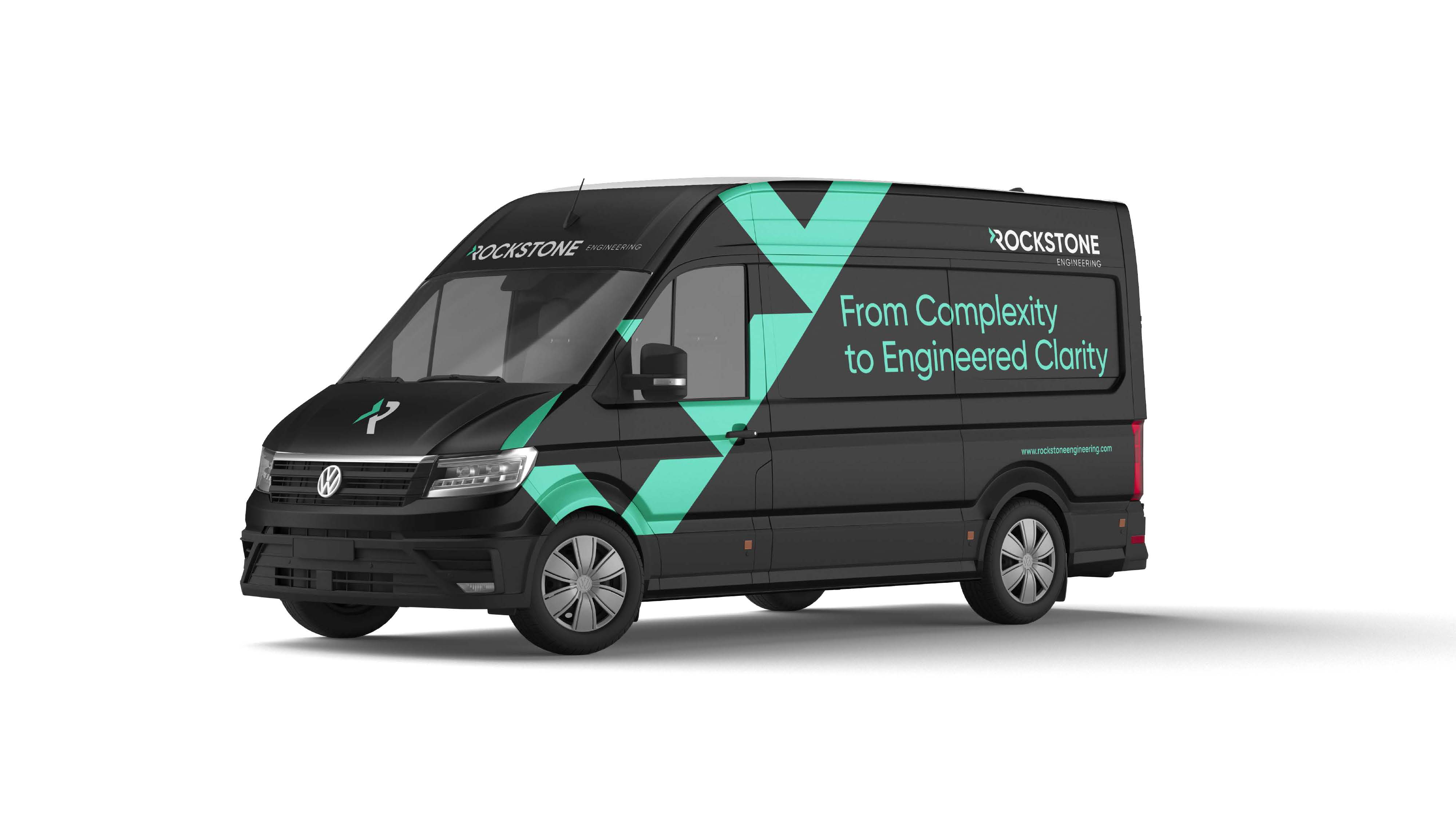
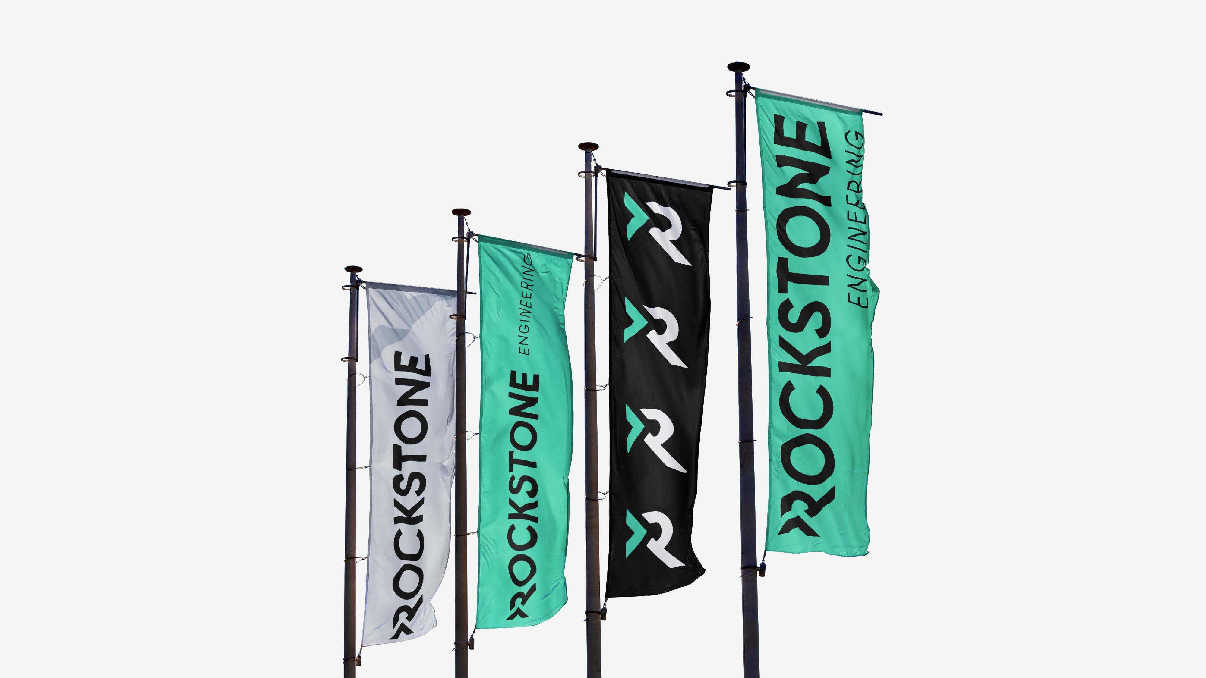
The dated corporate cube gave way to a custom ‘R’ symbol built from geometric shapes: a stone form cut at 45° and split into a forward arrow — progress, precision and momentum in a single mark. The palette moves from True Black and Pure White to a signature Signal Green / Process Teal, with Industrial Grey support; Gilroy carries the typography. The positioning — ‘from complexity to engineered clarity’ — runs throughout.
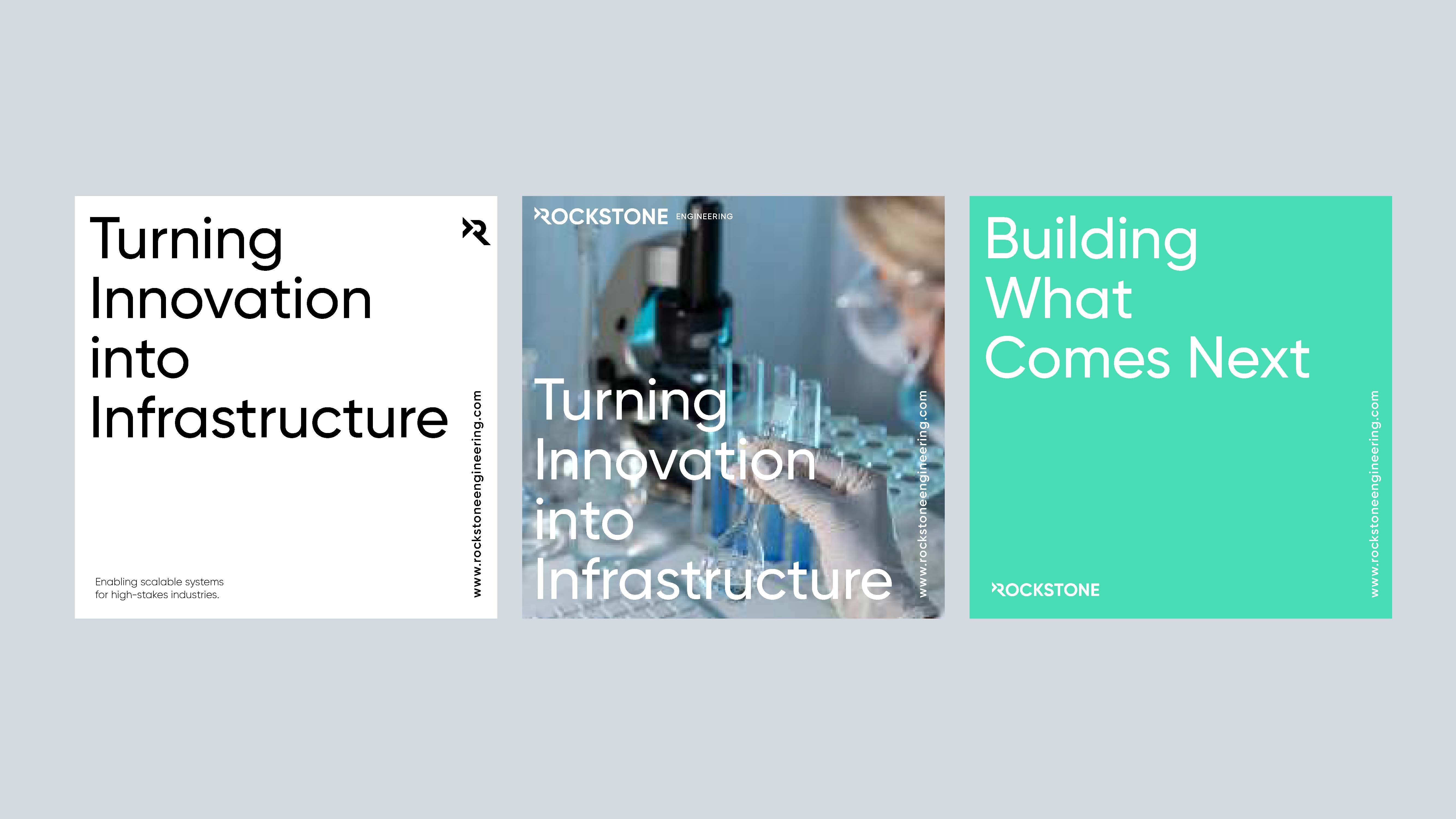
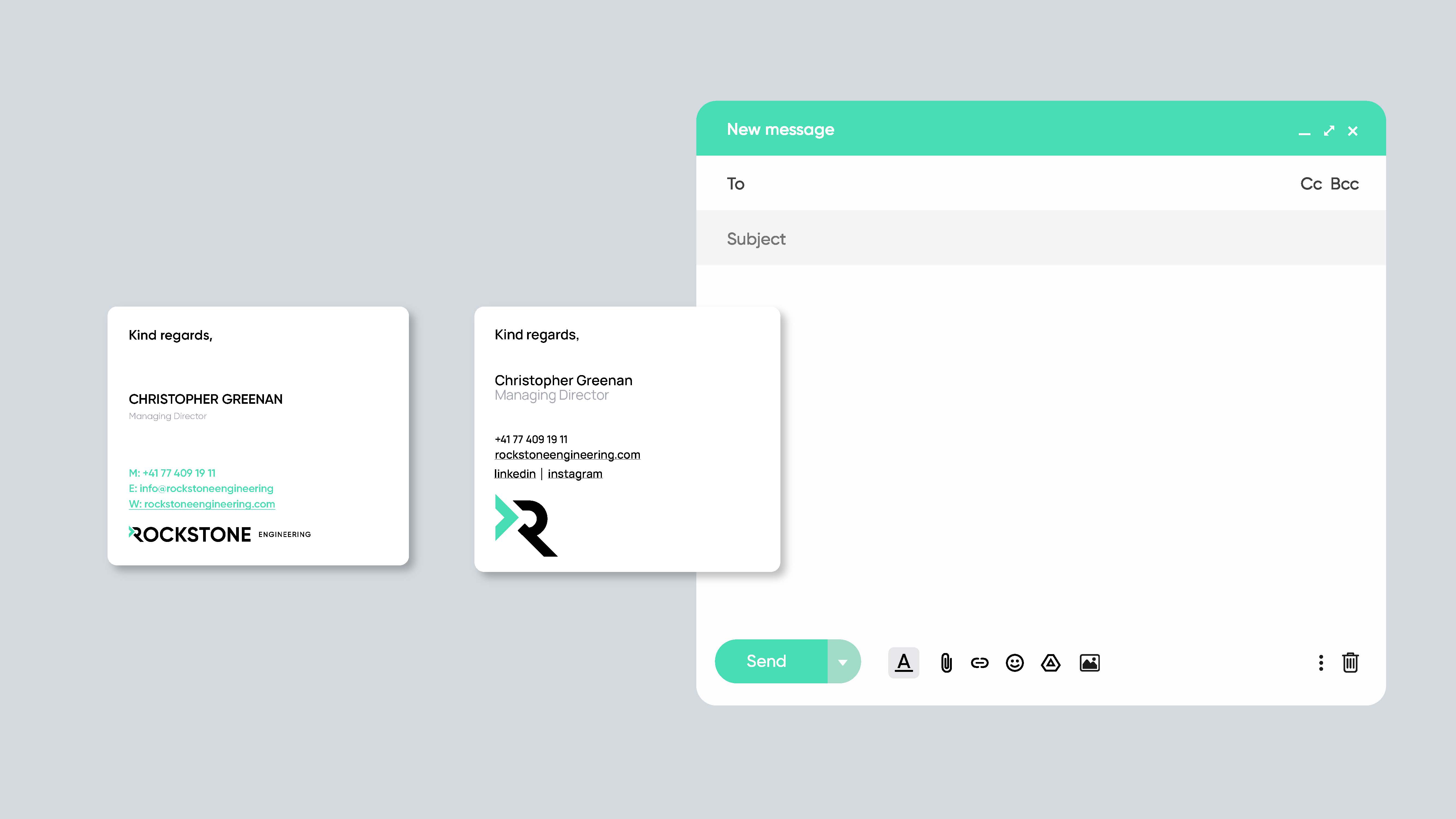
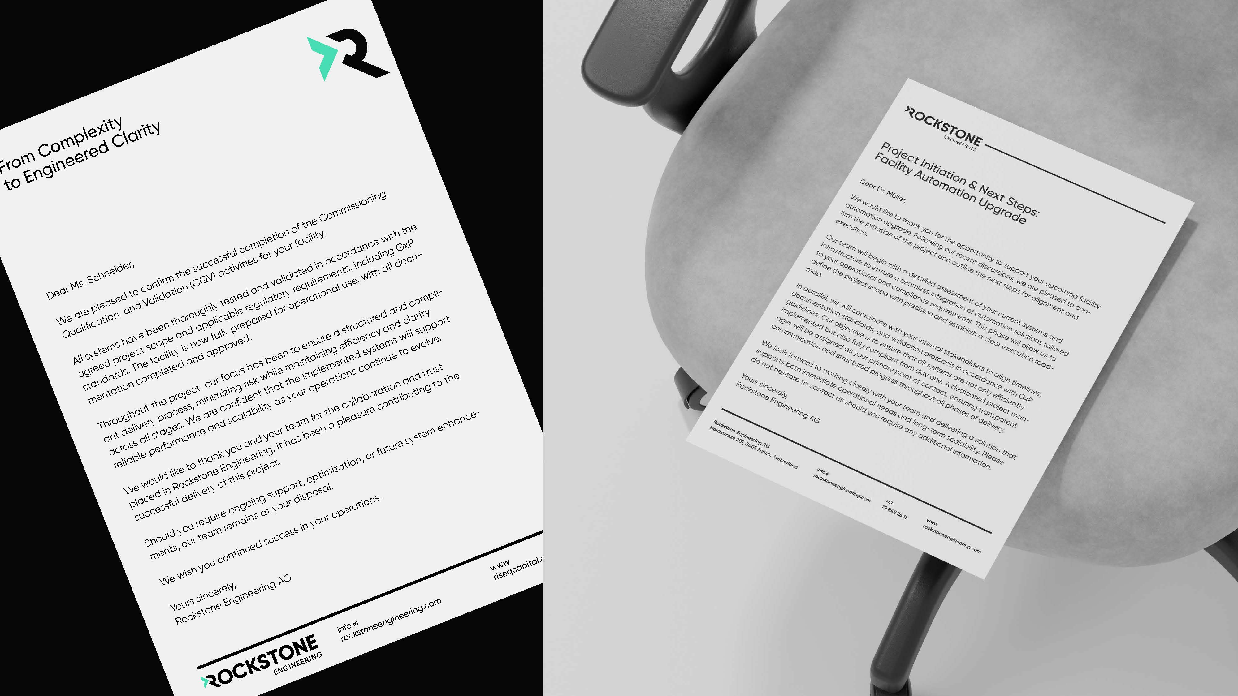
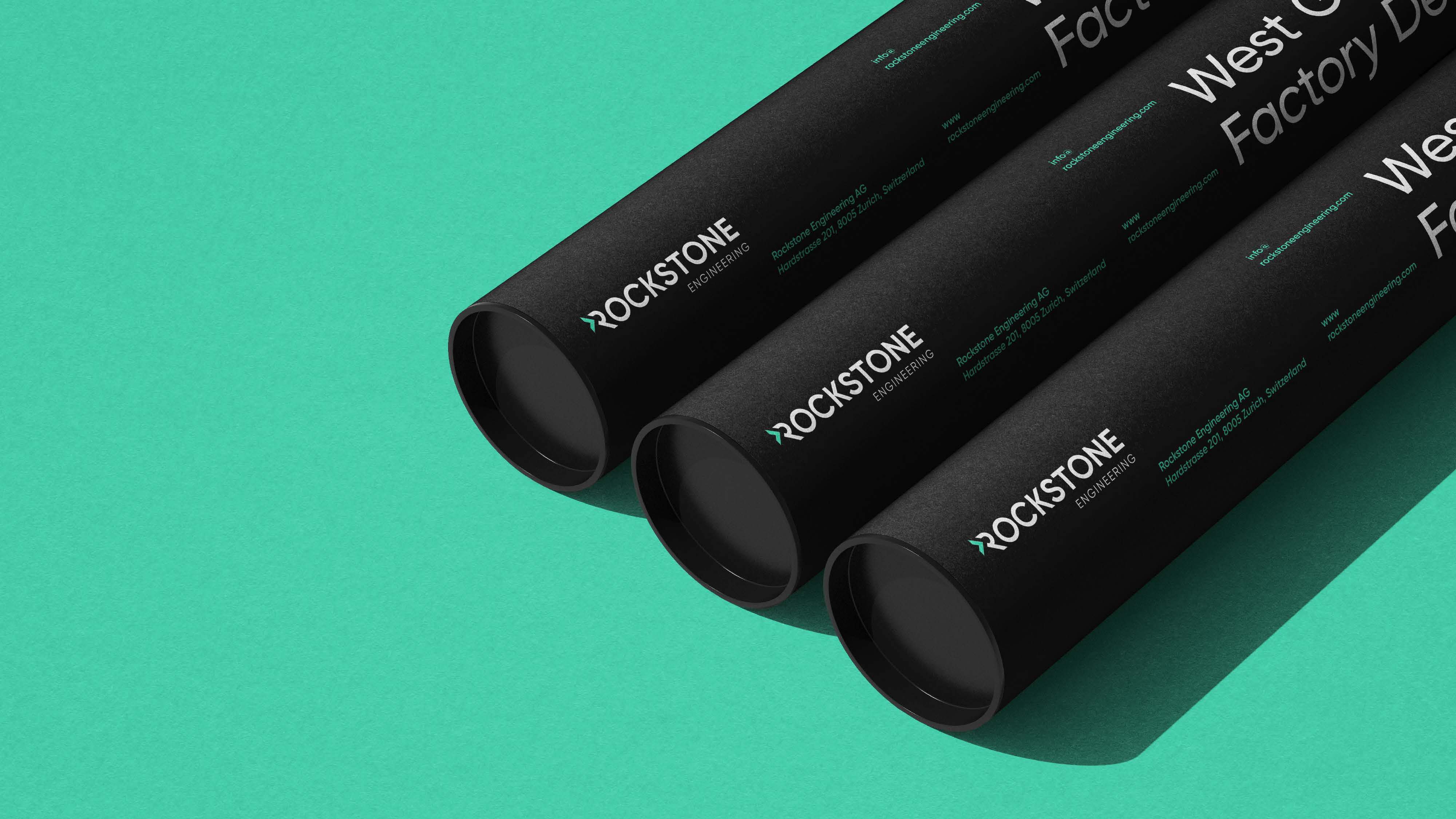
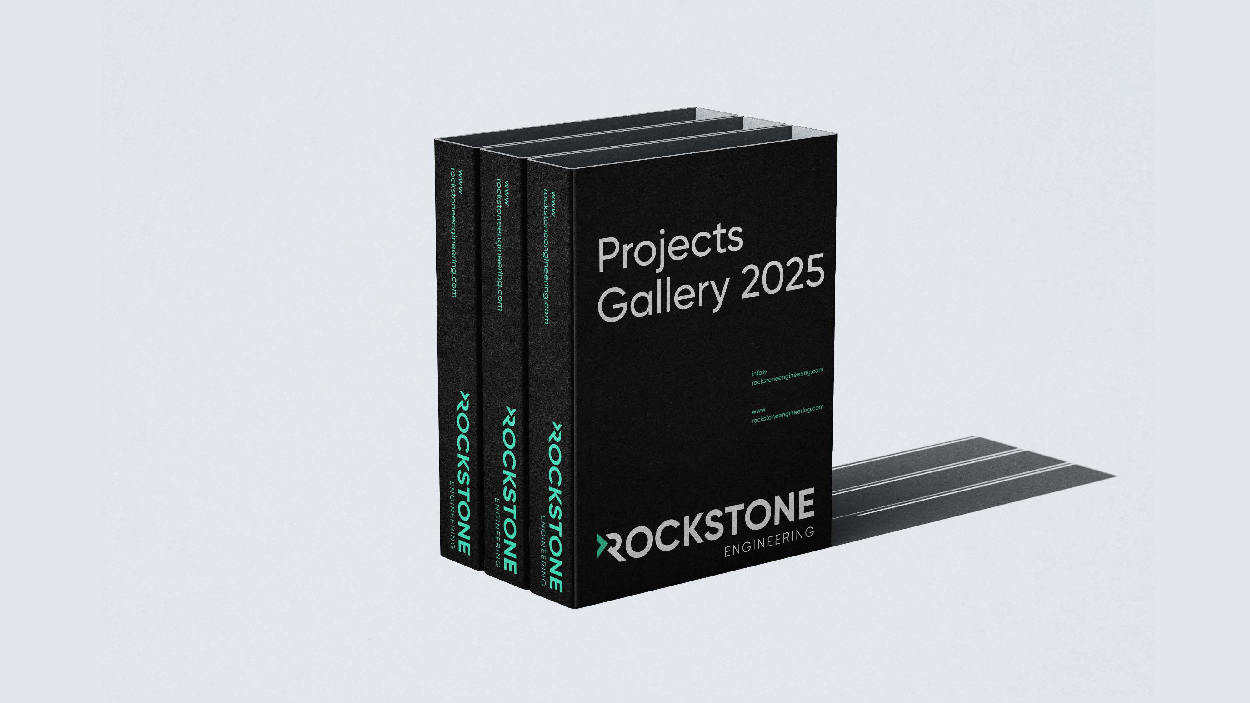
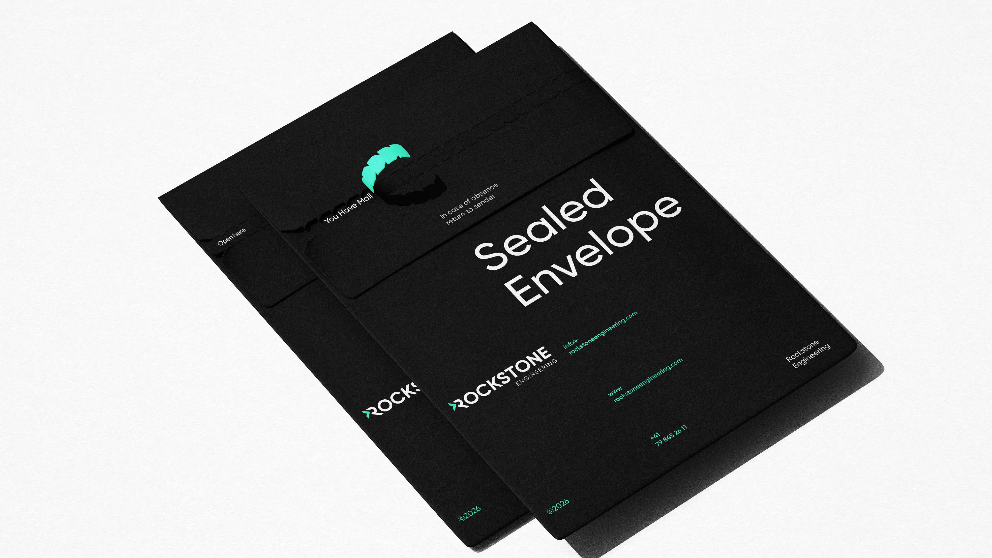
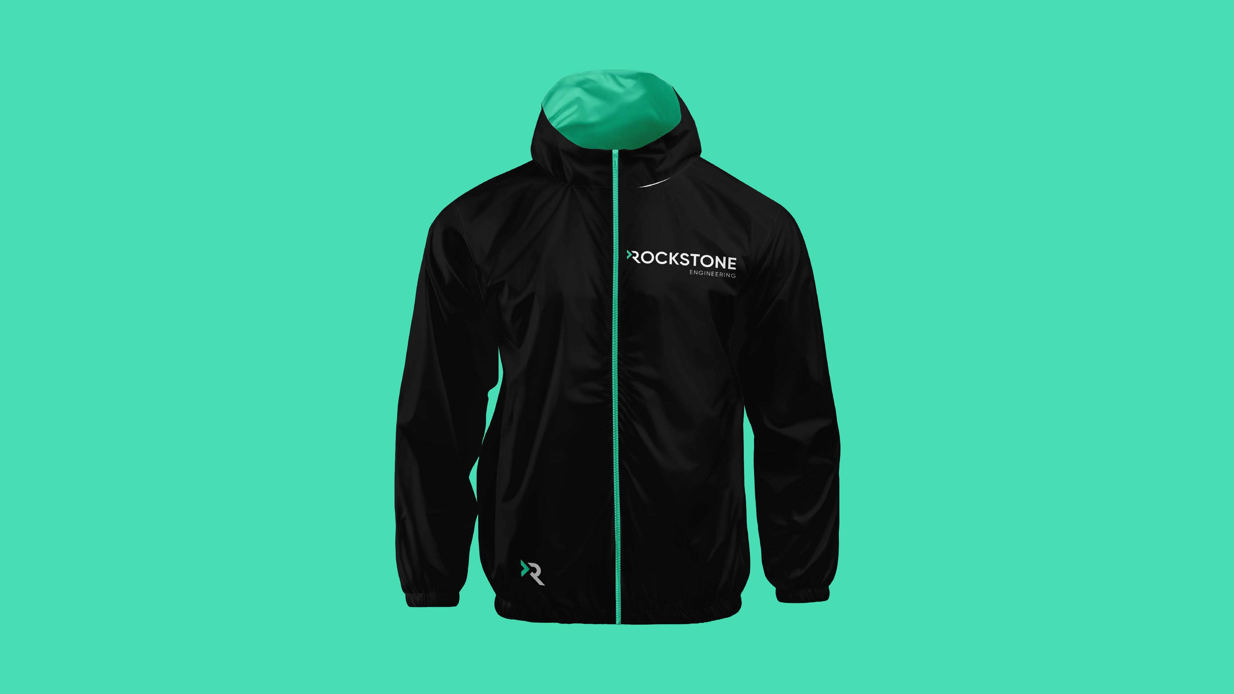
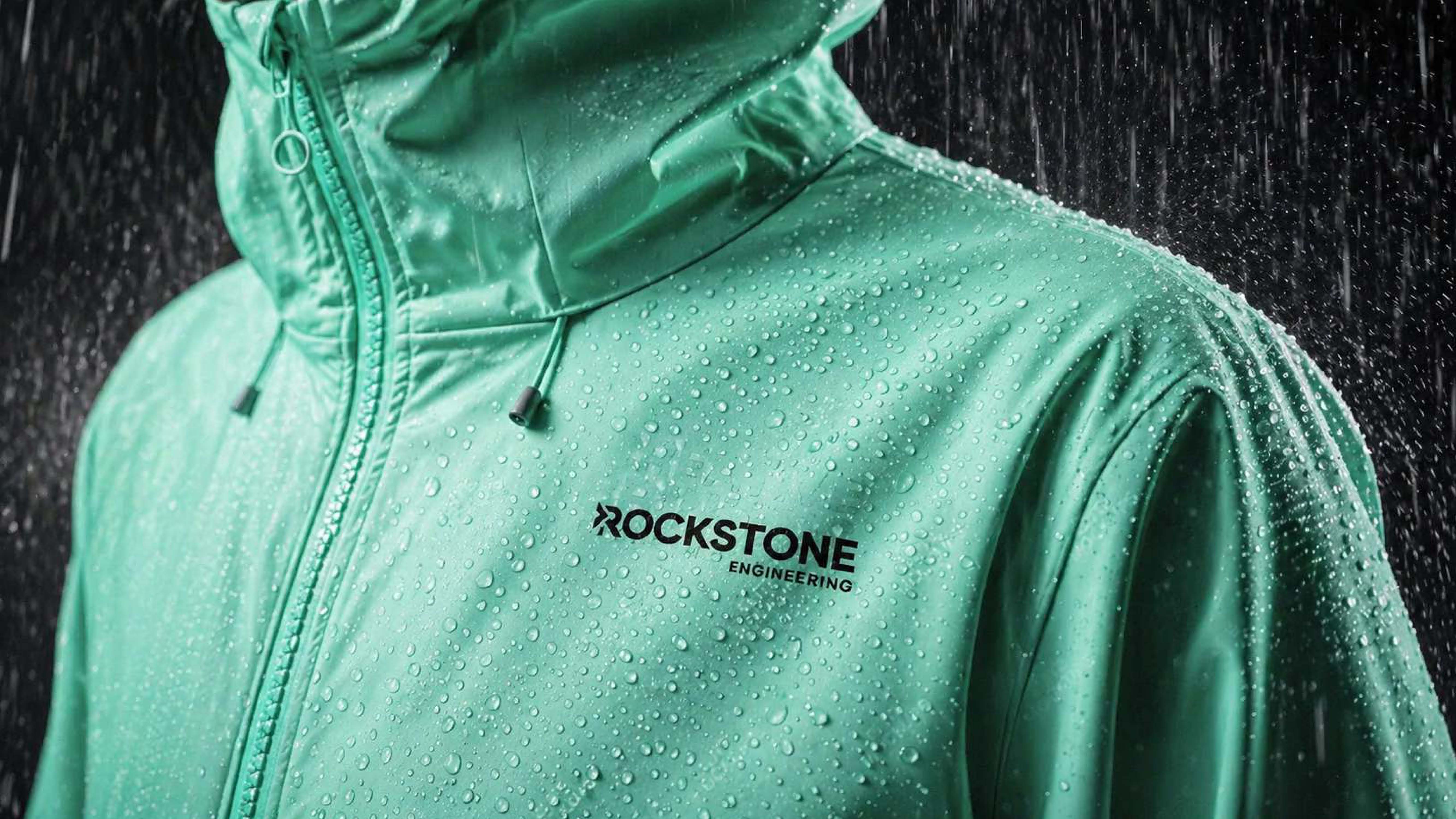
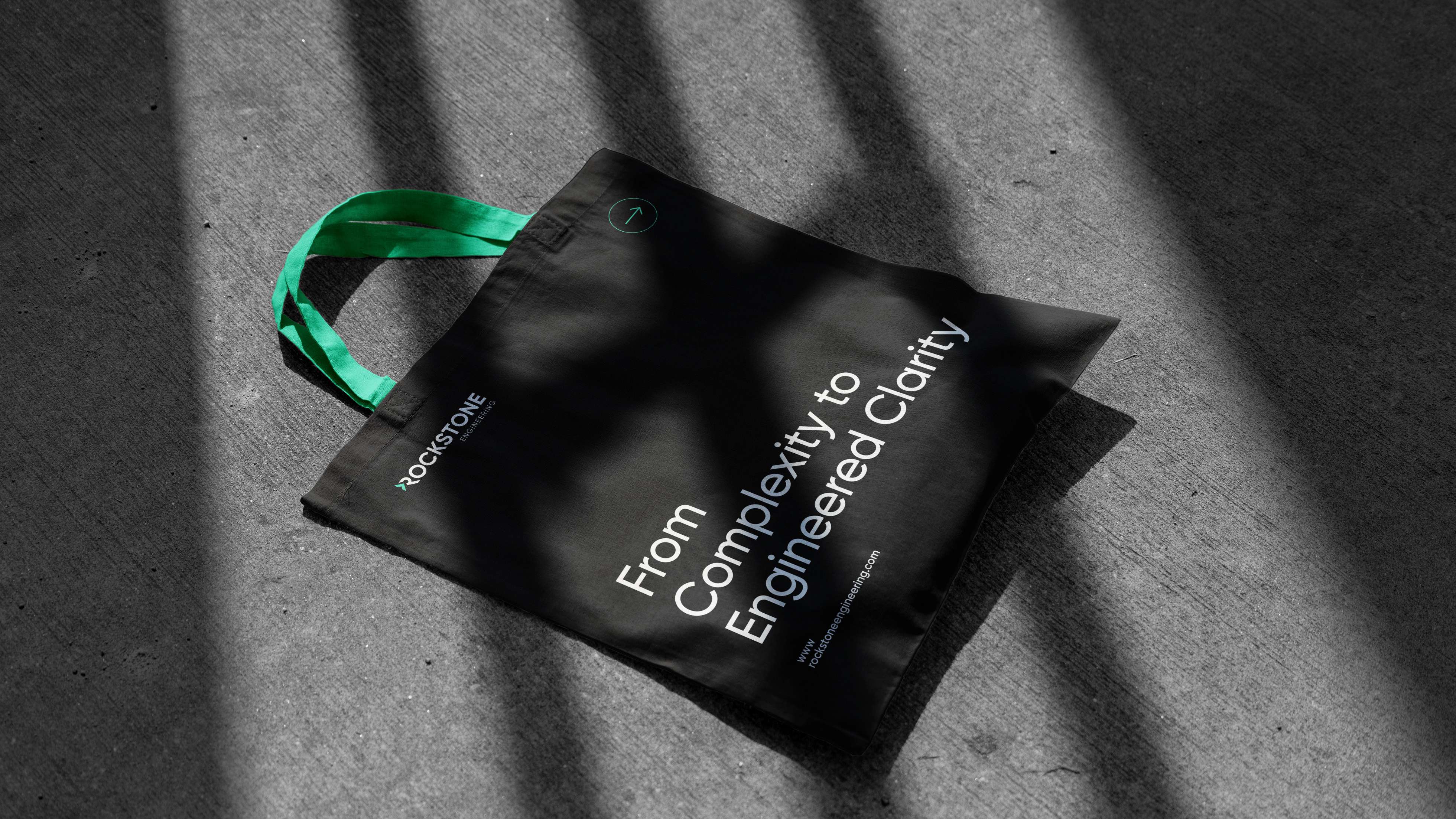
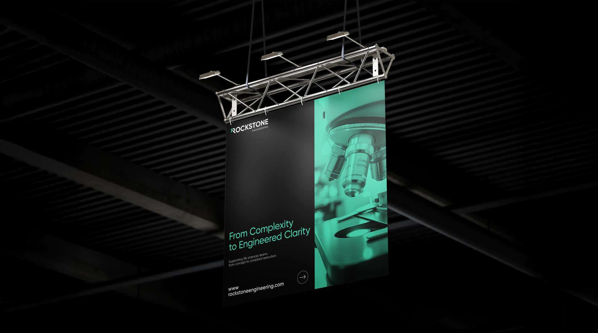
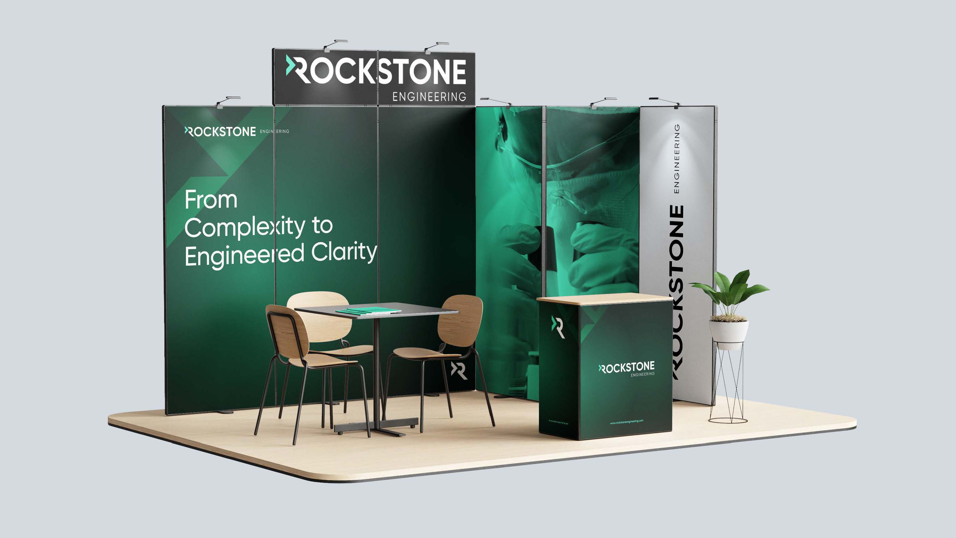
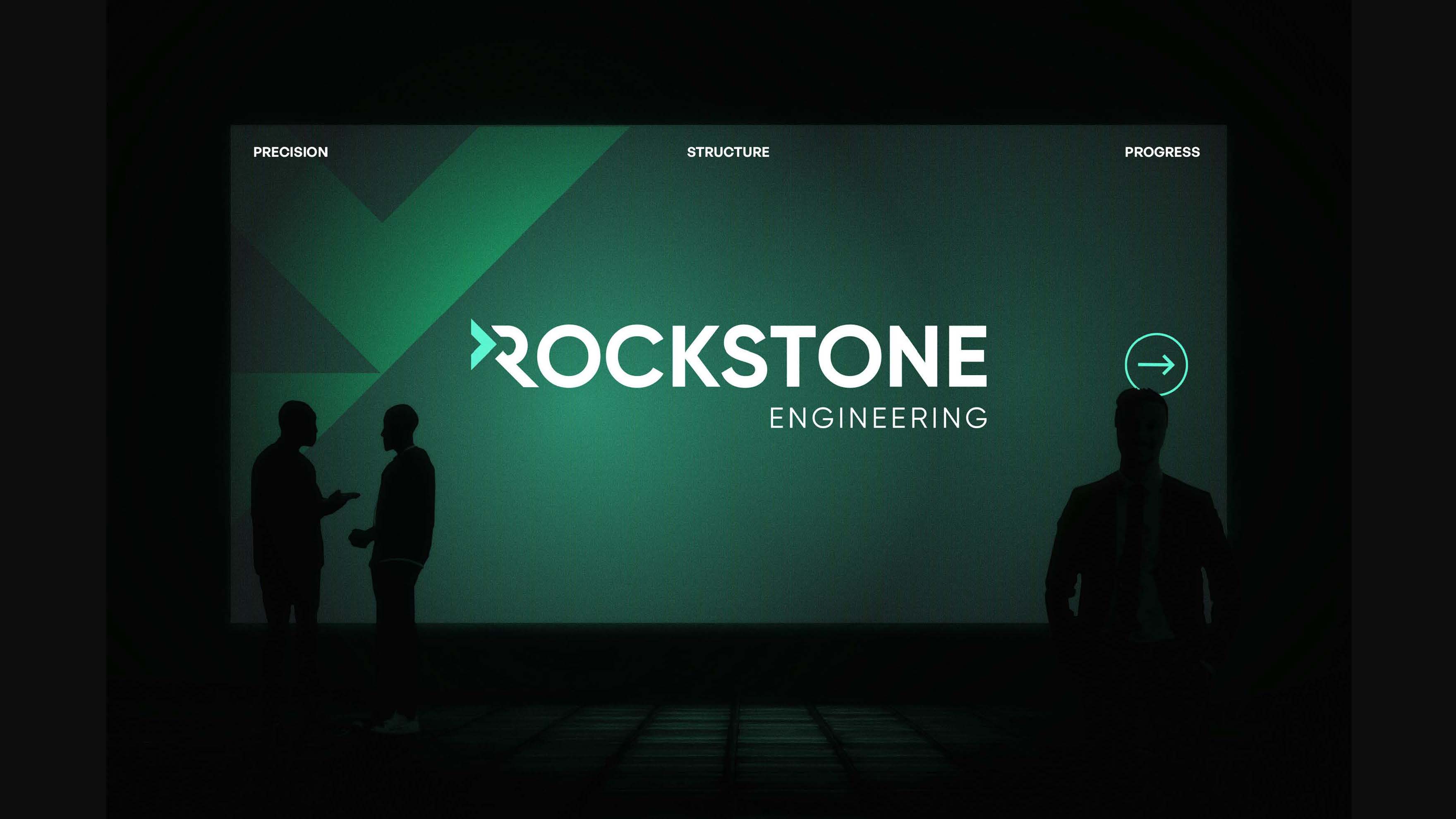
We extended the system across stationery, large-format and environmental graphics, apparel and merchandise, vehicle livery, exhibition stands, signage, flags and digital — codified in a full visual-identity guideline so the brand stays precise at every scale.

We had a fantastic experience working with Ruler Digital Agency on the development of the Rockstone Engineering website. From start to finish, the team were professional, responsive and incredibly easy to work with. They took the time to understand our business, our brand and what we wanted to achieve, while also bringing their own ideas and expertise to the project. Communication throughout was excellent, and any feedback, changes or questions we had were always dealt with quickly and efficiently. Nothing ever felt like too much trouble, and we really appreciated the attention to detail and support throughout the entire process. We’re delighted with the finished website and feel it represents Rockstone Engineering and where the company is heading extremely well. A huge thank you to the entire Ruler team. I would absolutely recommend them to anyone looking for a knowledgeable, creative and genuinely great digital agency to work with.
Kinga Koziol
Rockstone Engineering