trueport
Navigating The Future Of Port Cost Management
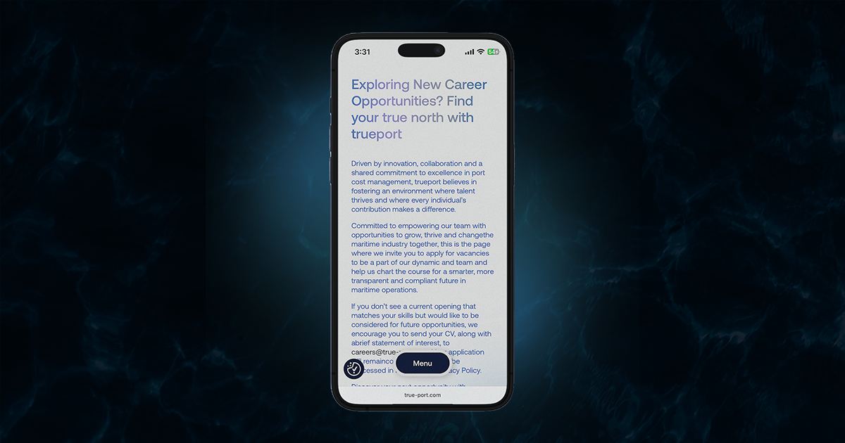
VISIT WEBSITEtrueport.com is the newly launched digital gateway to the world’s first global port cost ecosystem, docking a new era of operational excellence dedicated to the ones who move the world. Built from the ground up with clarity and purpose, the website mirrors trueport’s bold vision to an industry that needs it the most. Through a streamlined interface and a clean, future-facing layout, users can now navigate services, explore the product’s core, and understand the platform’s impact. From ship owners to managers, operators and port agents, trueport.com can now empower maritime professionals to operate with precision, compliance, and confidence. Rooted in deep industry knowledge and bold vision, the new site reflects a design language not just to keep up with the future, but to define it.

The Challenge
To design a digital presence that cuts through the noise of one of the most opaque sectors in global trade. In an industry long clouded by transparency defined by outdated systems and fragmented information, the task was to bring structure without rigidity, insight without overload, and responsiveness at the pace of today’s operations. The TruePort website had to communicate a bold, modern vision, one grounded in trust, operational sharpness, while offering a user experience as streamlined and future-ready as the solution itself.
What we did
The Backend Behind a New Industry Standard
TruePort’s new website was developed with a custom WordPress theme tailored for flexibility, speed, and growth. At the core lies a personalized admin dashboard, built to give the team full control without complexity. Under the hood, modern technologies including HTML5, CSS3, JavaScript, and GSAP.js power fluid animations, responsive layouts, and a seamless front-end experience. The result is a scalable, high-performing site that mirrors trueport’s mission: intelligent infrastructure, built to evolve.
Soft Curves, Strong Identity
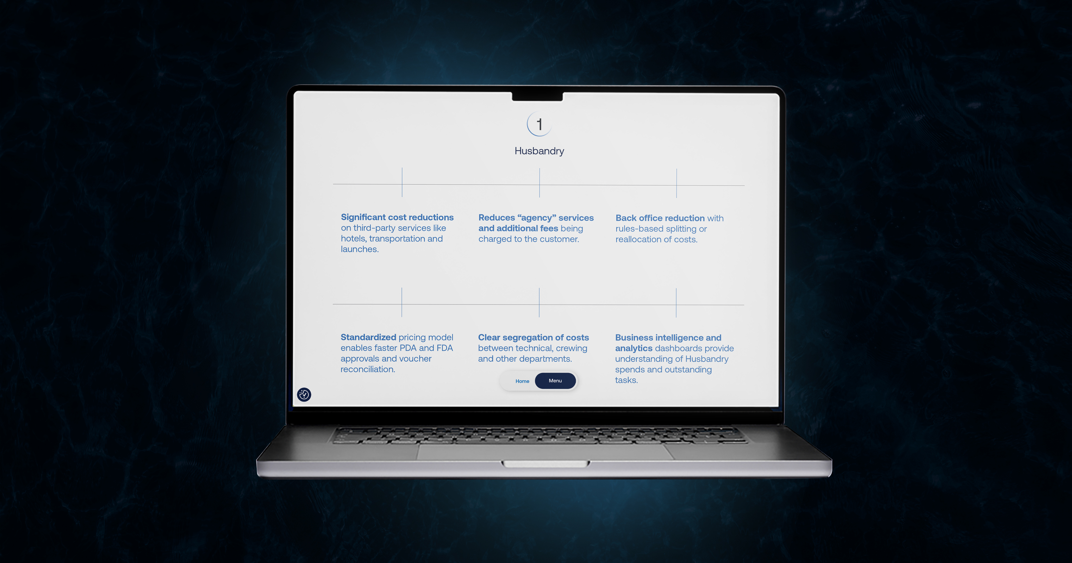
The visual language of trueport.com draws directly from the logo’s typeface, rounded forms and soft edges that signal approachability without losing authority. This design direction creates a fresh, minimal, and contemporary aesthetic that feels both professional and progressive. Subtle curves throughout the interface echo the website’s intuitive nature, while maintaining a clean, structured layout that reflects control and reliability. A design that doesn't just look good, but reinforces the brand’s values with every interaction, and at every touchpoint.
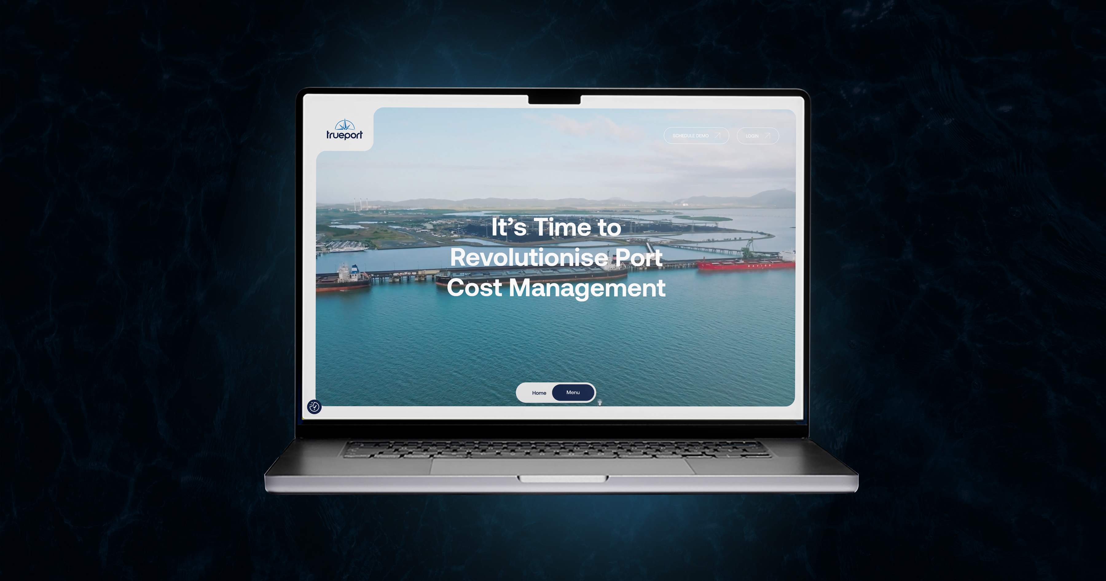
Atmosphere With Intent By Layered Light
Design artistry met with deliberate UX thinking where subtle hues of light guide the eye, enhance readability, and bring a sense of quiet modernity to the digital experience and its visual atmosphere. The background gradients across trueport.com are more than visual flair, they serve a functional role in guiding focus and enhancing legibility. Soft shifts in tone add a sense of depth and dimension, creating visual hierarchy without overwhelming the content. This subtle layering contributes to the site’s fresh and contemporary feel, reinforcing a sense of modernity while keeping the user experience clean, readable, and intentionally refined.
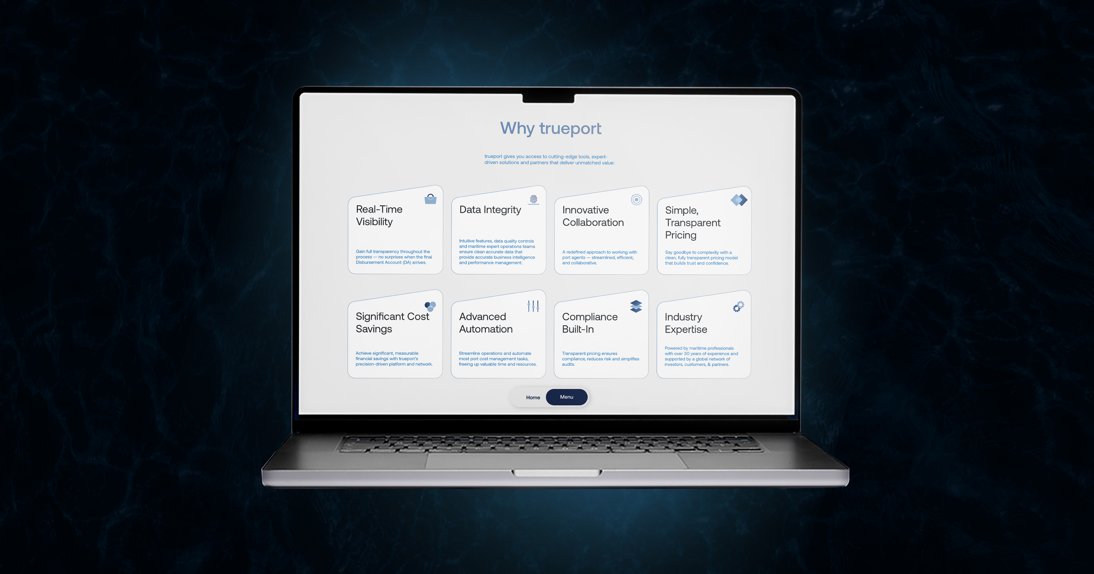
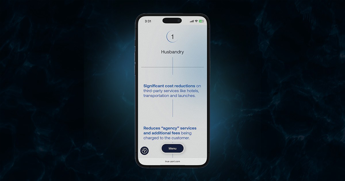
A Loop Of Design & Orbiting Ideas
In the Services section, a looping animated GIF circles each numbered offering, adding subtle movement, visual rhythm, and a sense of continuity. This dynamic element not only draws attention to key information but reinforces the rounded design language present across the site. The circular motion adds a layer of energy and flow, mirroring the platform’s complete, end-to-end approach to port cost management. It’s a small but deliberate touch that turns static content into a sharp and modern digital experience.
An Anchored Signature For Smooth Landing
A branded ending that holds it all together at the end of every scroll.
Each page on trueport.com ends with a mark of trust, concluding with a custom-branded footer, a consistent visual anchor that reinforces authority and expertise. From typography to color treatment, the footer elements are an extension of the core identity, offering both utility and brand recall. Designed not just to close the journey but to unify it, the footer ensures that no matter where the user lands, the experience remains cohesive, credible, and unmistakably TruePort. Branded till the last pixel.
Where Minimal Meets Meaningful
Simplicity with substance. The new trueport.com is built on clarity, not clutter. It’s minimal without being cold, fresh without chasing trends, and professional without losing approachability. Every design choice was made to serve the user: clean interfaces, intuitive navigation, and a calm visual rhythm that reflects the platform’s authority. In an industry that often overwhelms, TruePort’s digital presence stands out by making complexity feel simple, and the future feel accessible.