Mart
A New Age Website For The New Era Of Living
VISIT WEBSITEMore than just a portfolio, mart.gr is a digital home for the future of living, where modern design meets web craft, and Mart Construction’s forward-thinking vision comes to life. Built as a seamless, intuitive experience, the website reflects the brand’s high-end aesthetic and holistic approach to construction. From everyday renovations to large-scale developments, visitors are invited to explore wow-factor projects, discover tailored services, learn about Mart’s standout values, and select - or get inspired - for their next dream home real time, all within a refined and functional online space.
The Challenge
To translate Mart Construction’s futuristic design echoes into a digital experience that feels just as visionary. The goal was to create a safe place where architecture, location, and commerciality co-exist and thrive. Aligning high-end appeal with functional clarity, sparked an online journey that mirrors Mart’s design boldness while guiding visitors toward their next step.
What we did
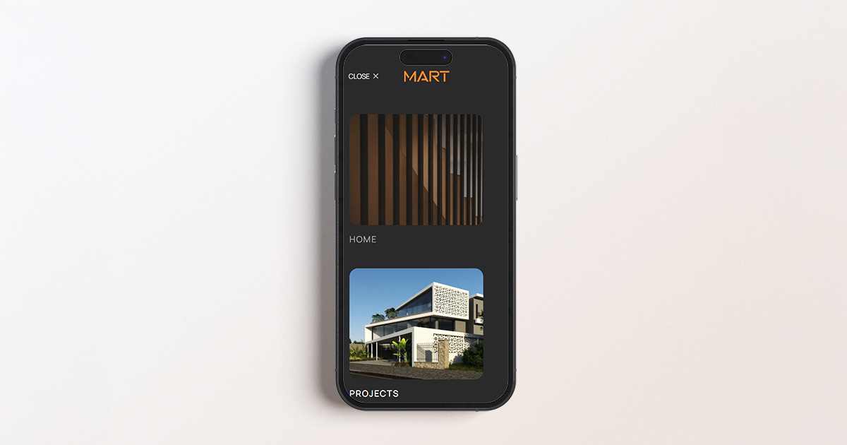
A Living Logo That Builds with You
The Mart logo isn’t static, it moves with purpose. As visitors scroll, the logo transitions from a subtle white mark to a bold, full-screen animation before retreating into a compact orange form that stays with the user throughout the homepage journey, anchored in a soft, blurred header (glassmorphism-inspired). This dynamic feature is more than design flair; it symbolizes Mart’s A-to-Z philosophy, ever-present, adaptable, and foundational to every step of the construction process. Like the projects Mart delivers, the logo grows, evolves, and stays with you.
A Visual Pulse of Place and Purpose
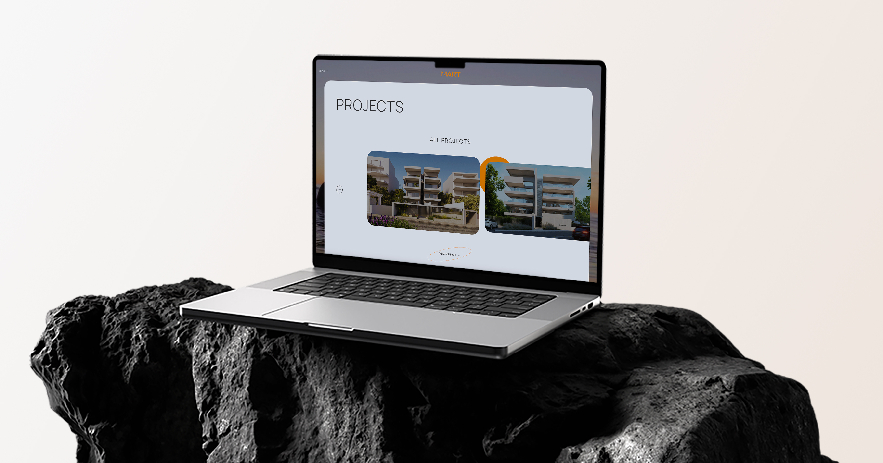
At the core of the web design lives a full-screen background video, a looping visual journey through Mart’s world. Interchanging scenes of Athenian landmarks, southern vistas, Riviera aerials, sunset magic, and glimpses into Mart’s headquarters, the video acts as the digital backbone of the design. More than atmosphere, it sets the tone in each page: a curated blend of place, precision, and architectural ambition. It reflects the brand’s deep connection to southern Athens and subtly reinforces Mart’s presence as both builder and storyteller within the cityscape.
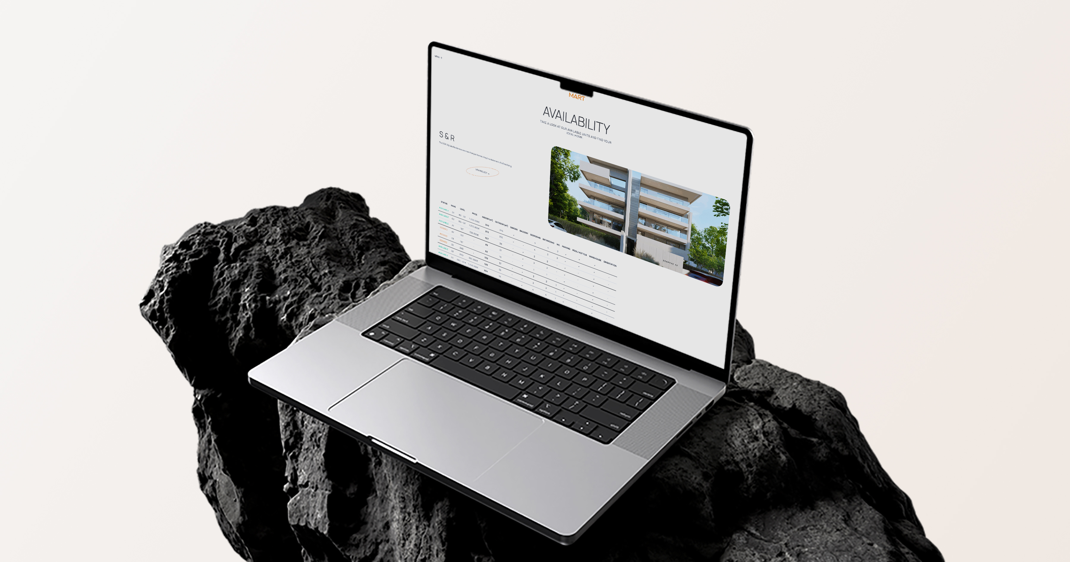
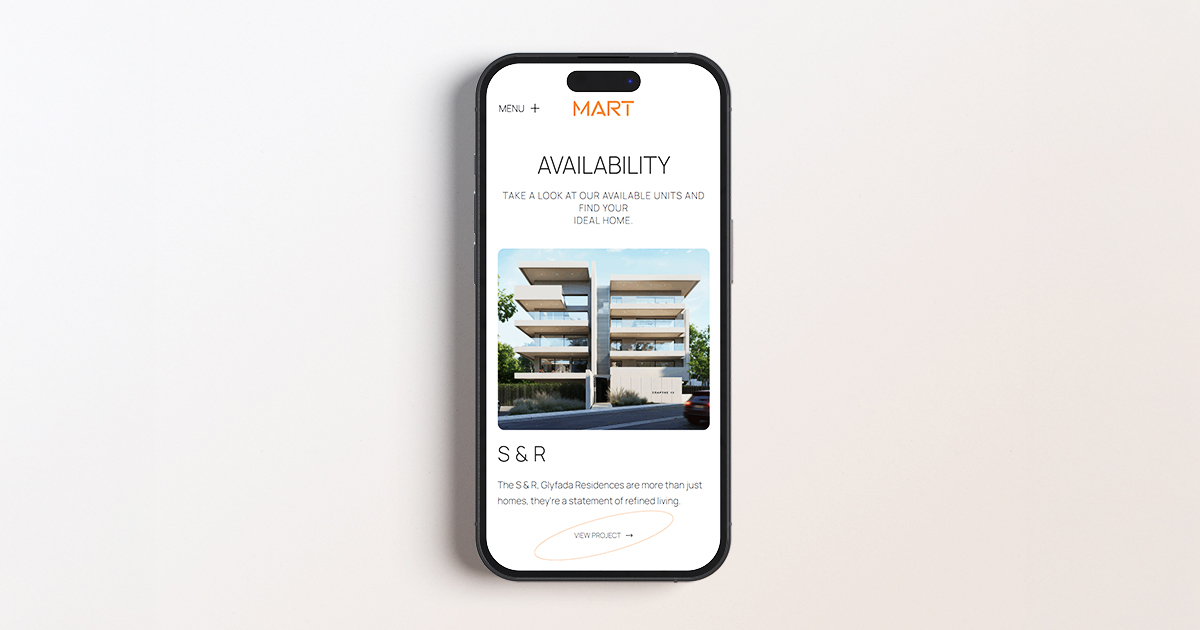
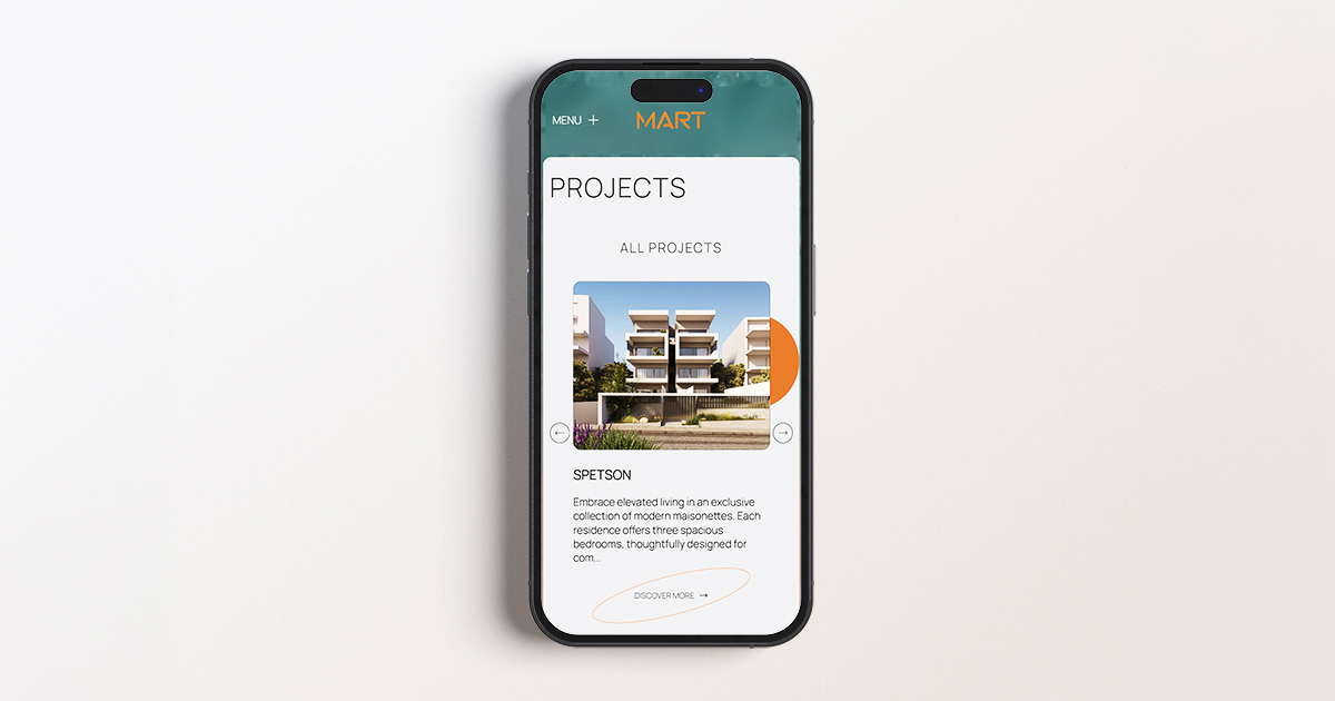
From Showcase to Sales Tool
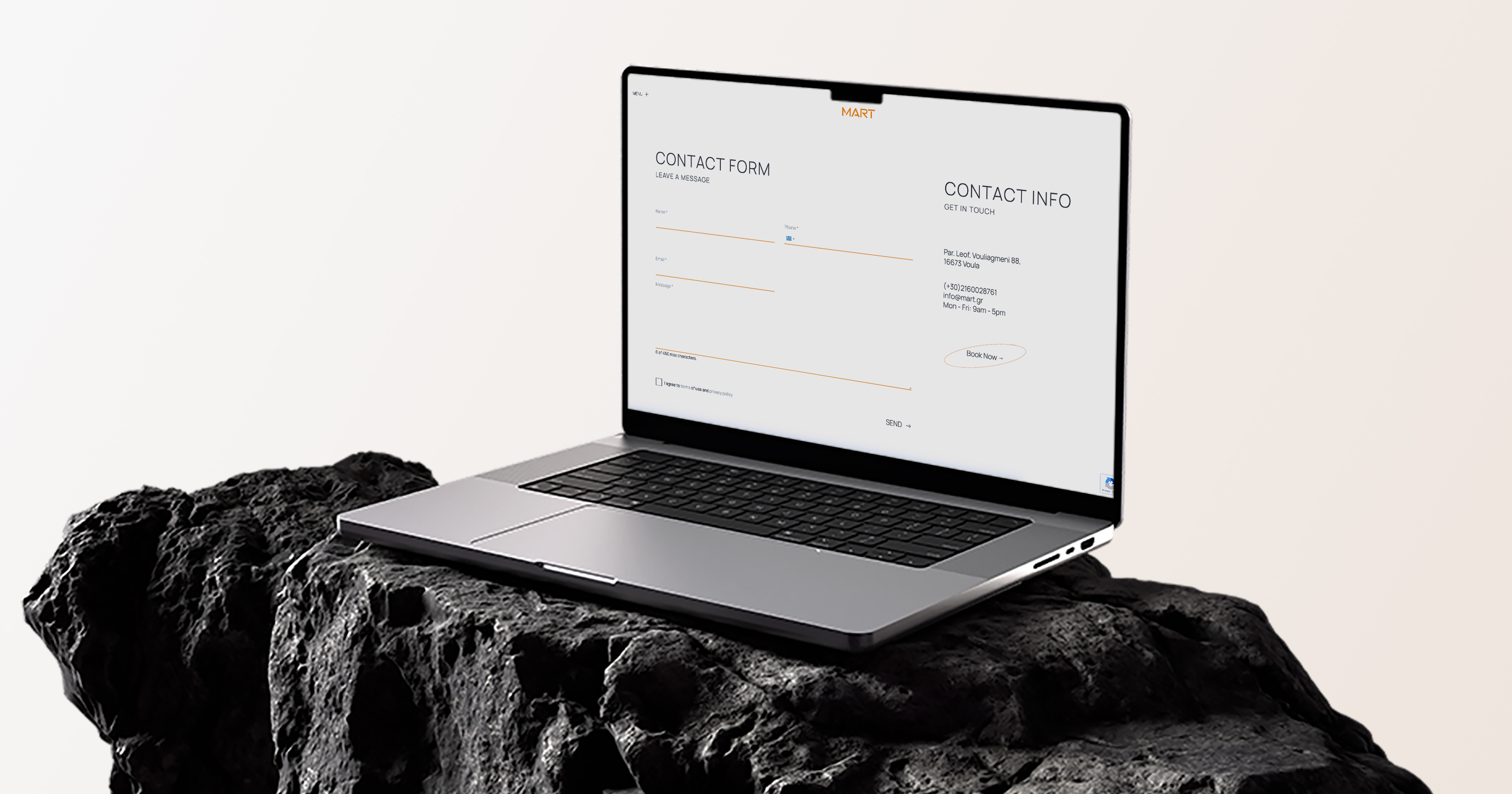
Beyond aesthetics, the website delivers on function, with each project presented through its own dedicated, detail-rich page. This structure allows users to explore individual properties or developments with clarity, supported by live availability updates that transform browsing into action. Whether it's a renovation, a residential build, or a commercial project, the platform bridges inspiration with immediacy, reinforcing Mart’s role not just as a creator of spaces, but as a strategic partner in decision-making and sales.
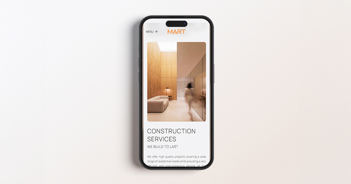
Architecture Meets Editorial Aesthetics
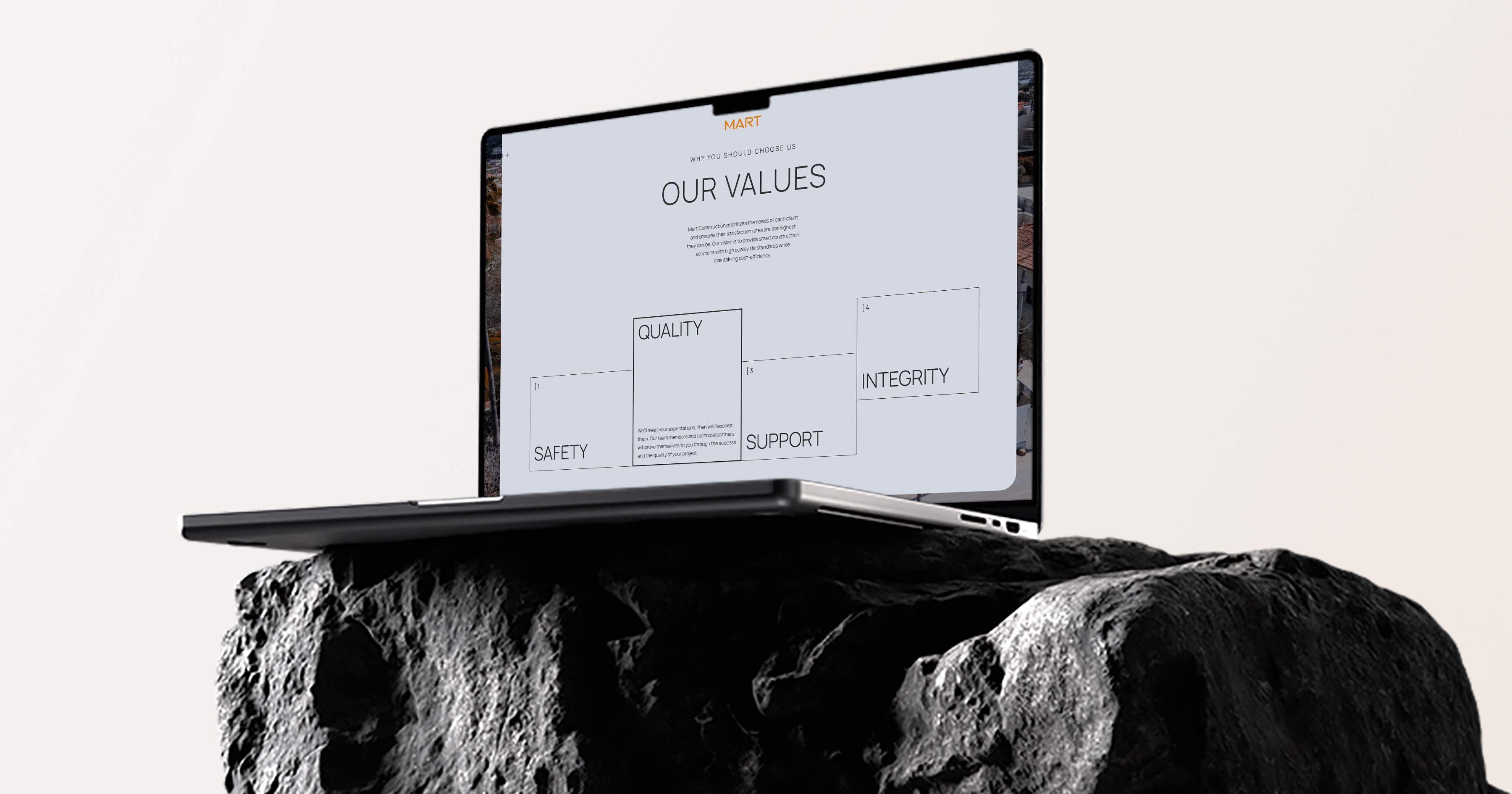
The overall website layout borrows from high-end editorial design. Clean grids, generous spacing, and image-first storytelling are creating a rhythm that feels more magazine than marketing. This deliberate fashion-forward approach aligns with Mart’s own design language: bold, refined, and detail-obsessed. The result is a homepage that feels curated rather than constructed, setting forward the visual codes of architecture, fashion, and luxury, all in service of a timeless digital presence.
Space That Speaks Clearly
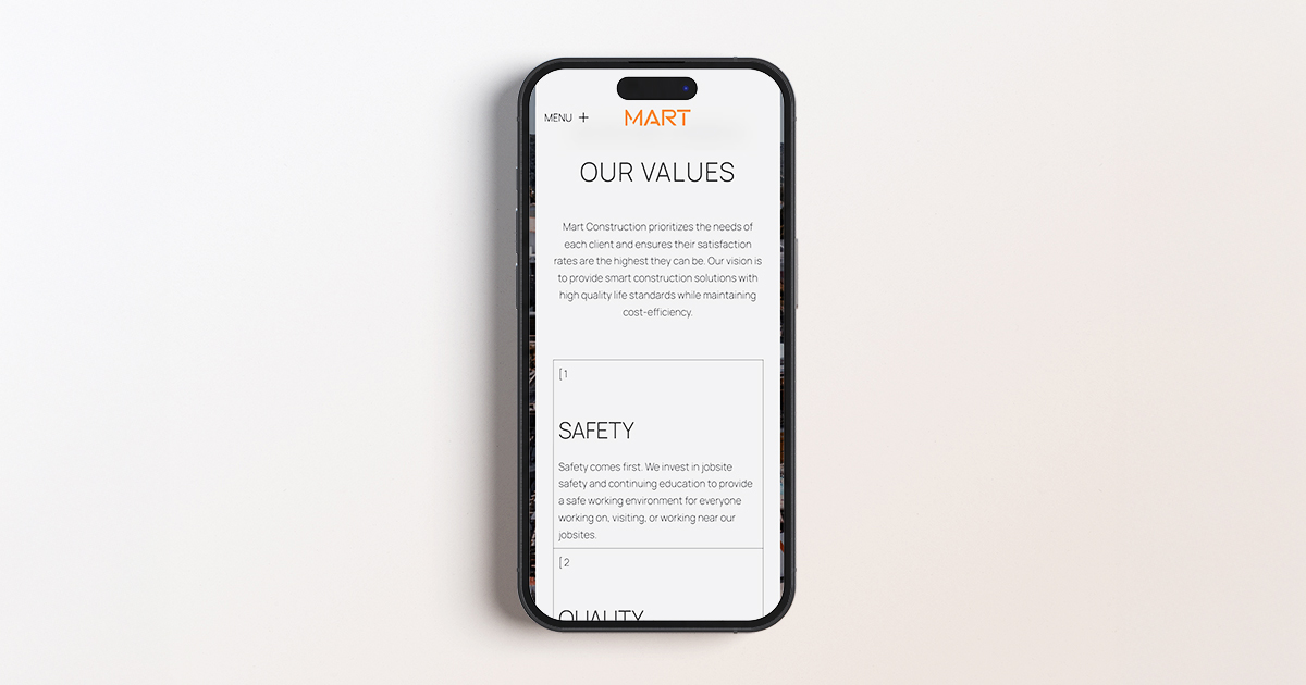
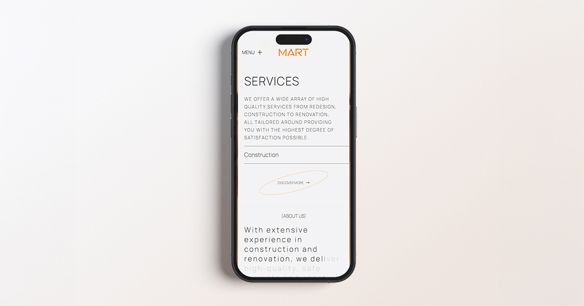
Every word on the website breathes, surrounded by intentional white space that enhances clarity, focus, and flow. This design choice isn’t minimalism for the sake of trend, but a deliberate move to reflect Mart’s commitment to precision and quality. By allowing content to stand on its own, the site becomes easier to navigate, more elegant to read, and aligned with the visual language of refined architecture.
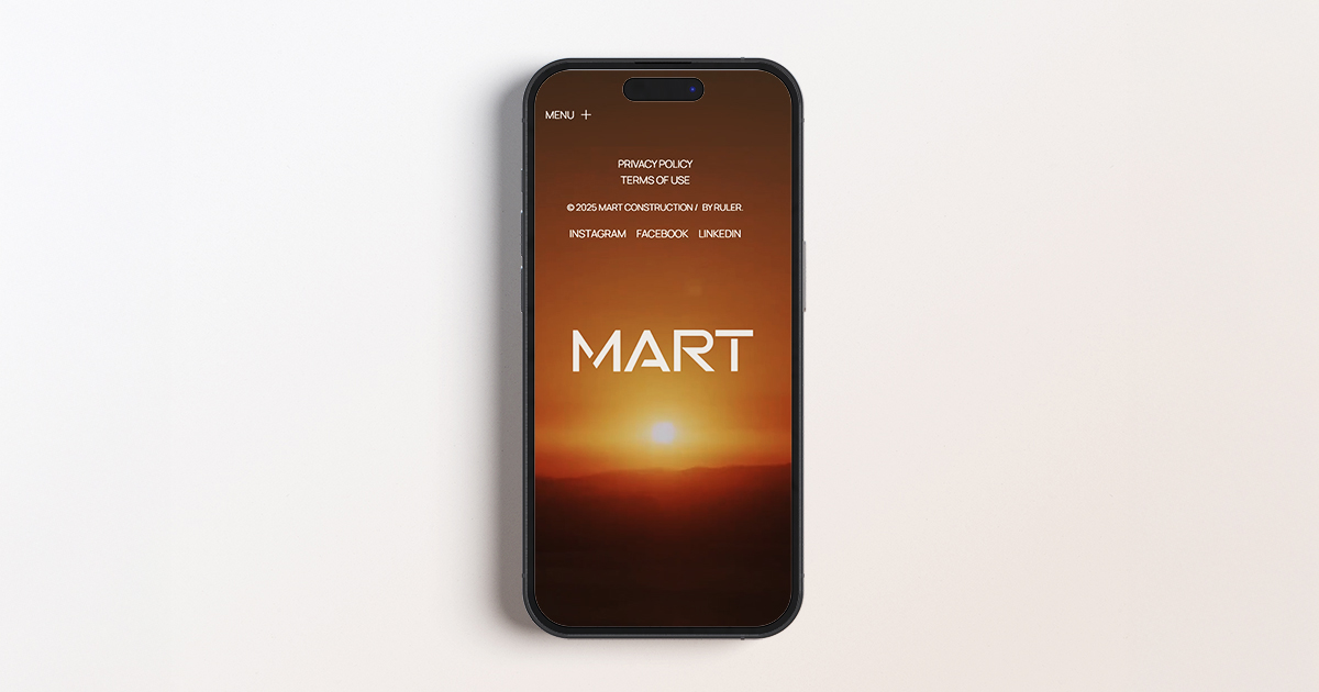
A Sunset Signature in Every Detail
Orange isn’t just a brand color, it’s a tribute. Used thoughtfully across the logo and key design elements, this warm tone mimics the iconic sunsets that wash over the Athenian Riviera, a natural spectacle that defines Mart’s geographic and emotional landscape. More than visual consistency, the color choice reflects a deep respect for place: anchoring the brand in its surroundings while guiding the user’s eye to what matters most. It’s branding with intention, design with a view. Sunset chasers can stop the pursuit, and finally rest in their new forever home.